stratengineai.com
Landing Page Analysis
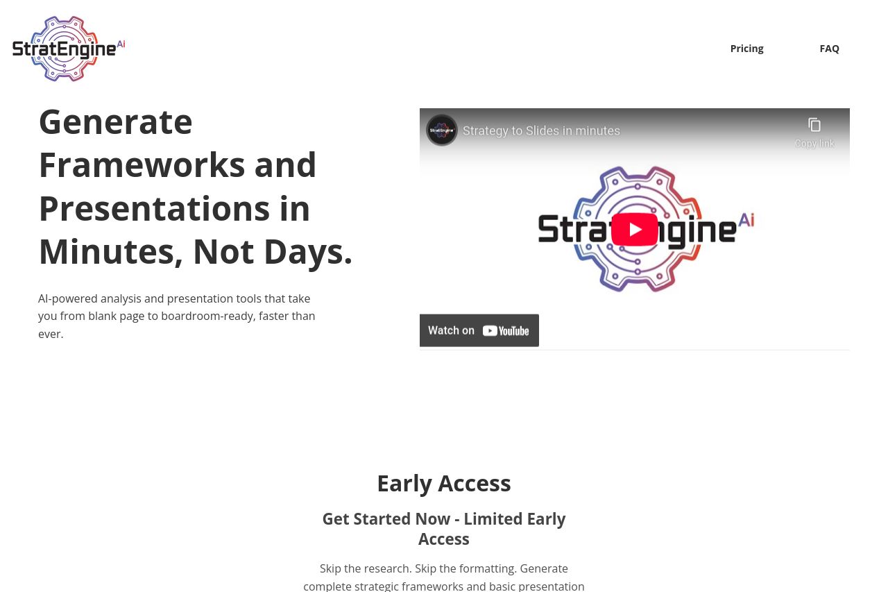
AI-powered analysis and presentation tools that take you from blank page to boardroom-ready, faster than ever.
Summary:
StratEngine AI's landing page attempts to convey the efficiency of its AI-powered presentation tool, targeting consultants and executives. The main headline boldly asserts its core benefit, but the second line falls flat with lackluster and vague phrasing. The visual design is basic and uninspiring, bordering on bland, with its minimal use of color and lack of creative design elements. The call-to-action buttons are clearly placed but don't stand out due to their muted colors. Messaging key points are buried under lengthy and redundant text blocks, diminishing overall impact. The security section communicates credibility well, but the general visual consistency and engagement are lacking across the board.
In short, the landing page needs better visual emphasis, crisper messaging, and more engaging design elements to captivate its target audience effectively.
- Revamp the visual design to include more engaging elements and bolder CTA contrast.
- Refocus the messaging to be sharper and more concise.
- Enhance visual hierarchy by using varied typography and colors to guide attention.