sigmudhealth.com
Landing Page Analysis
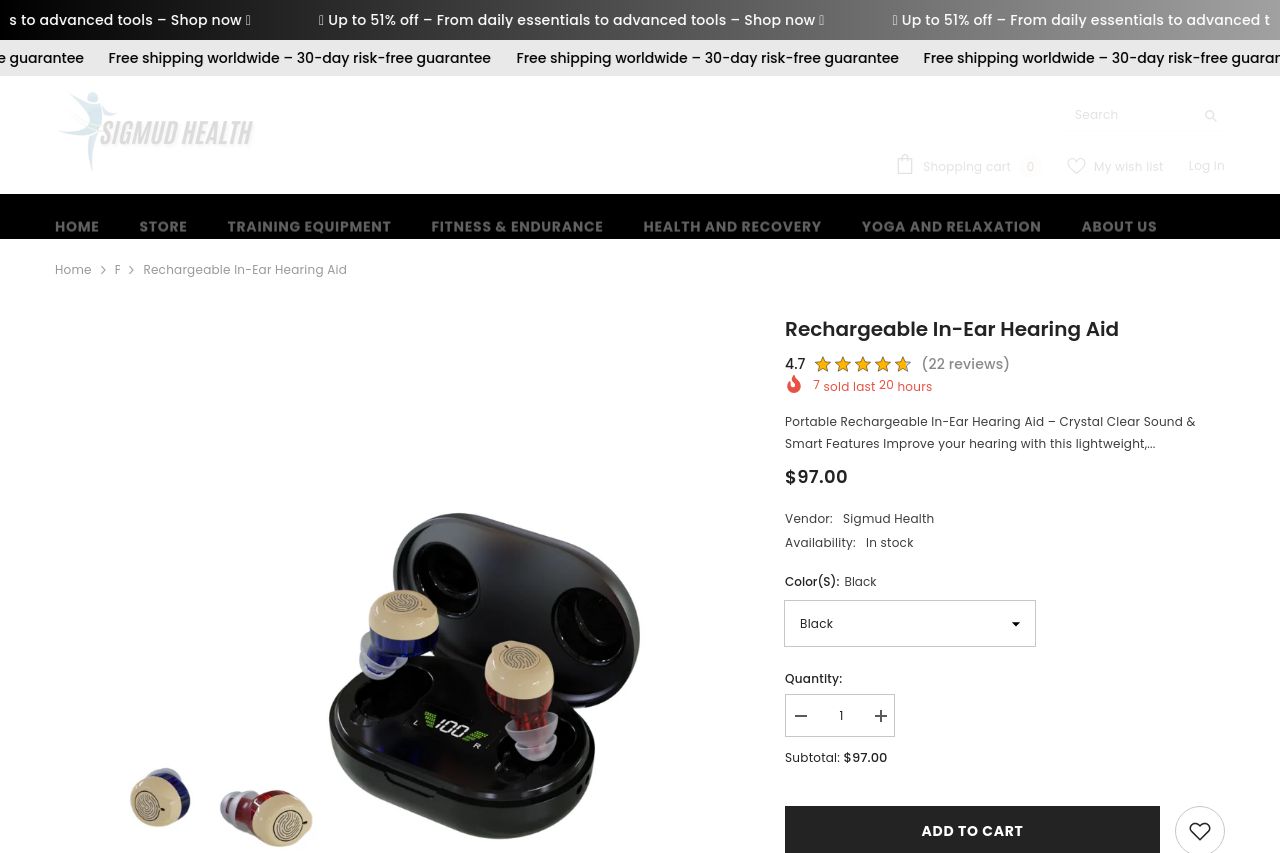
Portabel Uppladdningsbar Hörselapparat i Örat – Kristallklart Ljud & Smarta Funktioner Förbättra din hörsel med denna lätta, diskreta och användarvänliga hörselapparat. Perfekt för daglig komfort
Summary:
Overall, the page is decently structured but lacks in some areas that could enhance user engagement.
The value proposition is there but not highlighted effectively. The product's benefits are somewhat clear, though they could be more emphasized. The text itself tries to be concise, which works in some parts, but the lack of engaging headers and subheadings buries some key points.
Design is very straightforward but doesn't feel cohesive or sophisticated. The lack of color variety makes the page bland, even though the contrast is generally acceptable. Consistency is somewhat maintained, but the layout feels uninspired.
The structure is functional but can be improved by visually separating sections more distinctly. Calls to action (CTAs) are present but don't stand out enough to draw immediate attention.
Social proof is present with reviews and ratings, adding to the product’s credibility, but the absence of recognizable brand logos or trust badges might undermine that effort. Transparency is good, with plenty of contact options and company information displayed.
- Emphasize the value proposition more clearly at the top with bold text or a banner.
- Enhance the visual hierarchy using more varied and bold typography.
- Improve CTA visibility by using contrasting colors.
- Add recognizable trust badges or partner logos to enhance credibility.
- Segment information with better headings and whitespace for easier navigation.