komforten.se
Landing Page Analysis
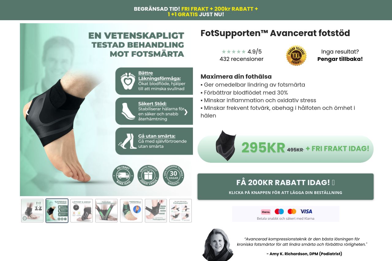
BEGRÄNSAD TID! FRI FRAKT + 200kr RABATT +
71
Share on:
Summary:
70
Messaging
60
Readability
60
Structure
60
Actionability
65
Design
90
Credibility
The landing page for FotSupporten™ provides a comprehensive overview but lacks focus. The messaging is clear in terms of what the product aims to solve but is bogged down with scattered information. The readability struggles due to large blocks of text and insufficient visual hierarchy, making it exhausting to follow. Design aesthetics are hindered by inconsistencies in typography and color usage, impacting the overall professionalism. Actionability suffers due to the overwhelming number of CTAs and repeated information, diluting urgency. However, the page does provide loads of social proof with numerous customer reviews, which boosts credibility significantly.
Main Recommendations:
- Streamline the section order to improve information flow and focus.
- Simplify the messaging by reducing redundant details and focusing on key benefits.
- Improve CTA placement and consistency for better actionability.