cloudworkstations.dev
Landing Page Analysis
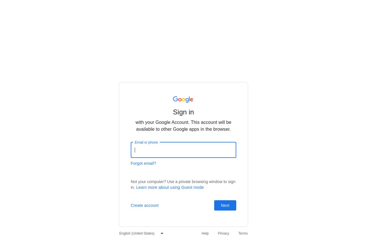
with your Google Account. This account will be available to other Google apps in the browser.
87

Generated on:
July 22, 2025Score:
87/100Share on:
Summary:
85
Messaging
90
Readability
90
Structure
90
Actionability
70
Design
70
Credibility
The login page prioritizes simplicity and clarity. The clean design and minimal distractions ensure that the user focuses on signing in without unnecessary elements. The form is straightforward, providing guidance with placeholders like "Email or phone." However, a touch more visual appeal or branding could enhance user experience, as it lacks any graphical elements that reflect the company's identity beyond the logo.
Main Recommendations:
- Consider adding a subtle background color or graphic to enhance visual interest.
- Ensure the form fields are distinguishable with clear labels and possibly larger font size to improve usability.
- Introduce brand consistency by incorporating more elements like logos or brand colors subtly.