metibala.com
Landing Page Analysis
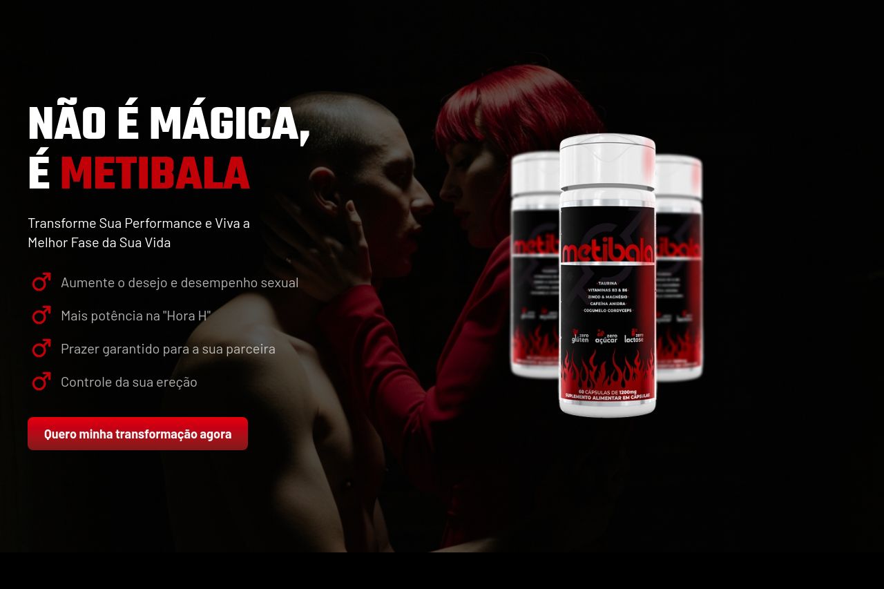
Impulsione seu rendimento com Metibala
Summary:
Metibala's landing page makes an immediate impact with a bold design and direct messaging focused on performance enhancement. The product's key benefits are clearly highlighted, but the aggressive tone might alienate some users.
The call to action is repetitive but strategically placed to capture conversions. While the use of red emphasizes urgency and action, some text could be more compelling by being slightly less aggressive. The credibility is backed by testimonials, yet the page lacks depth in explaining the science or providing transparent company details like a physical address.
Overall, the page combines strong visual elements with a clear value proposition, though it may benefit from more professionalism and transparency.
- Soften the aggressive tone to widen appeal to a broader audience.
- Enhance transparency with more company details and scientific backing.
- Diversify the imagery to appeal to a wider demographic.