hostingersite.com
Landing Page Analysis
Summary:
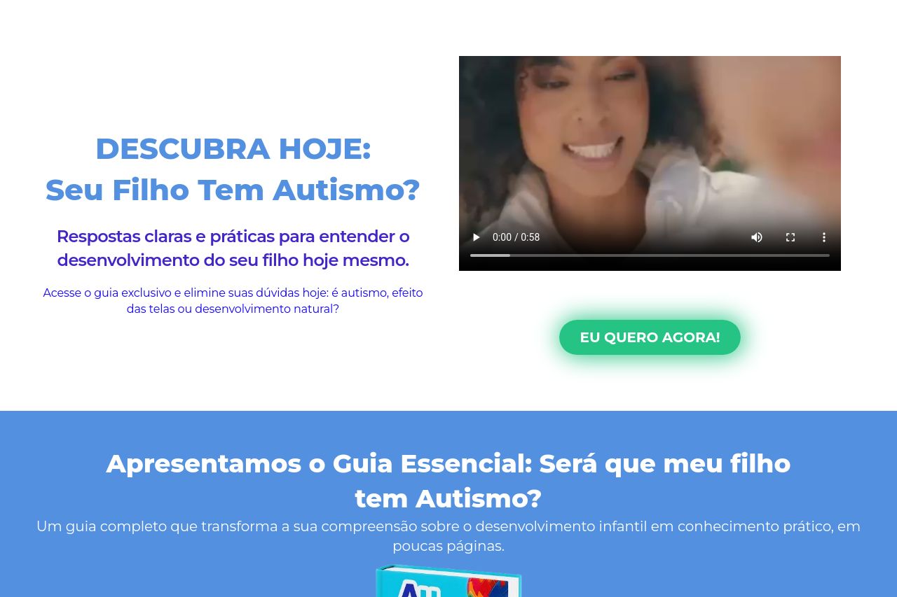
The landing page offers a focused product to help parents understand their child's potential autism spectrum condition. The emphasis on clarity and actionable content is commendable, with specific sections like the FAQs providing direct answers. However, there's a strong sense of monotony in the design, with mostly blue color blocking throughout, creating a visually boring experience. While the video element in the hero section is a nice touch, there could be more interactive content to break the text-heavy layout. CTAs need more clarity and visibility for quick conversion, and while testimonials add credibility, they blend in too well with the page, losing impact.
The information hierarchy needs polishing; there's room to reorganize content to lead the reader more strategically through the buying journey. Finally, the tone feels a bit too generic at times—some sentences could be more personalized to resonate better with worried parents.
- Enhance CTA visibility with contrasting colors and more engaging verbs.
- Diversify color scheme to maintain interest and guide the viewer’s attention.
- Reorganize content to improve flow and make logical connections between sections.