framer.app
Landing Page Analysis
In today's digital landscape, standing out requires not just a website but a smart website. Our latest customizable SEO agency template, crafted for Framer, isn't just visually appealing; it's optimiz
Summary:
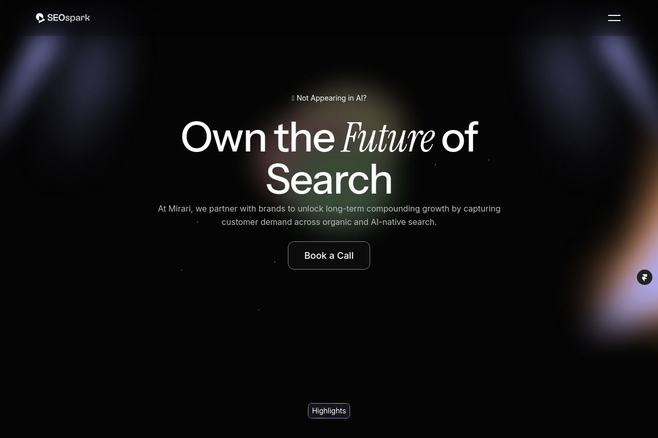
The landing page excels in some areas but struggles in others. The visual appeal with its sleek, dark theme is on point, enhancing the professional vibe. However, the overuse of dark backgrounds can drown out readability. The messaging clearly targets enterprise brands, aligning well with the audience, but isn't as sharp as it should be. The call-to-action ('Book a Call') is consistent, standing out thanks to repetitive placement, although it feels overplayed without variation or urgency. Text suffers due to clutter and poor layout, making it challenging to digest. There are good visual hierarchy elements, like differentiating text sizes, but inconsistent colors create distraction. The page embraces credibility well with testimonials. Yet, missing solid evidence like exact data or case studies can weaken its efficacy. Ultimately, clarity and focus could be improved significantly by streamlining content and eliminating any competing design elements.
- Use a lighter background to improve readability.
- Enhance CTA urgency with varied phrasing or urgency triggers like 'Limited Slots'.
- Add more examples or case studies for credibility and proof of capability.