blynchq.com
Landing Page Analysis
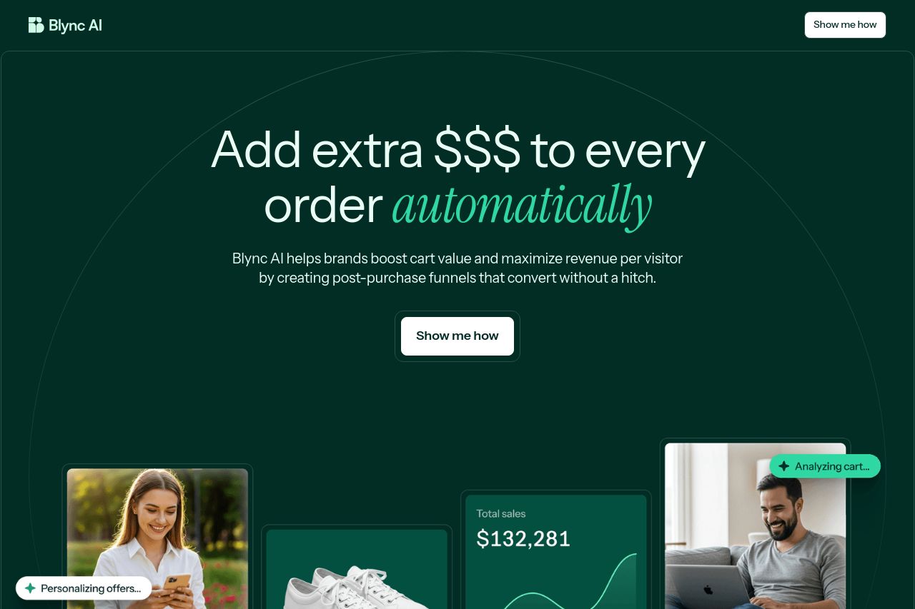
Blync AI helps brands boost cart value and maximize revenue per visitor by creating post-purchase funnels that convert without a hitch.
Summary:
The landing page does well in targeting eCommerce brand owners with its direct messaging about increasing revenue per order through AI-powered upselling. The dark color scheme with contrasting text is visually appealing, though the overall tone feels a bit too laid back given the seriousness of the service.
The hero section sets a clear expectation of what Blync AI offers; however, it lacks a compelling call to action that truly stands out. The comparison table and testimonials are good additions, but the content could be more persuasive by emphasizing unique value propositions more clearly.
The website's readability is decent, but some sections contain long paragraphs that could be broken down for easier scanning. The overall design is cohesive and professional but lacks enough contrast in some areas to highlight important elements like CTAs effectively.
- Increase the contrast for calls-to-action to make them stand out and communicate urgency.
- Break up longer paragraphs with bullet points or sub-headings for better readability.
- Strengthen the unique value proposition in the hero section by emphasizing differentiators more clearly.