higherenglish.online
Landing Page Analysis
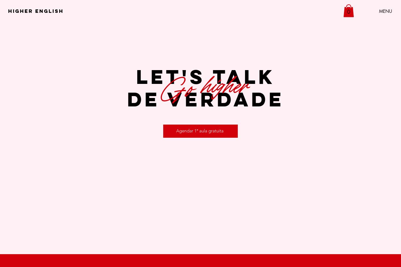
Higher English - Aprenda inglês com aulas online particulares ou em grupo. Método moderno, material internacional e turmas reduzidas. Fluência com leveza e resultados reais! Go Higher!
Summary:
The landing page for Higher English puts a heavy emphasis on bold reds and contrasting whites, which make for a visually striking design. However, the color scheme can be a bit overpowering and may strain the user's eyes. The main message is clear with a call to action for a free class booking, but the text could be more engaging and targeted. The flow from sections like 'Metodologia' to 'Para quem é nosso curso?' is logical, but the excessive use of large blocks of text might deter potential students. The actionability is strong with well-placed CTAs, although they could be more visually appealing. The credibility is unclear due to the lack of diverse testimonials or trust badges, which can undermine the perceived professionalism. Overall, while the page is not without its merits, it could benefit significantly from a more nuanced approach to design, messaging, and credibility indicators.
- Integrate more testimonials or trust badges to enhance credibility.
- Reduce the text block sizes and break them up with images or icons for better engagement.
- Use a more consistent color scheme to avoid overwhelming the user.