estoestunegocio.com
Landing Page Analysis
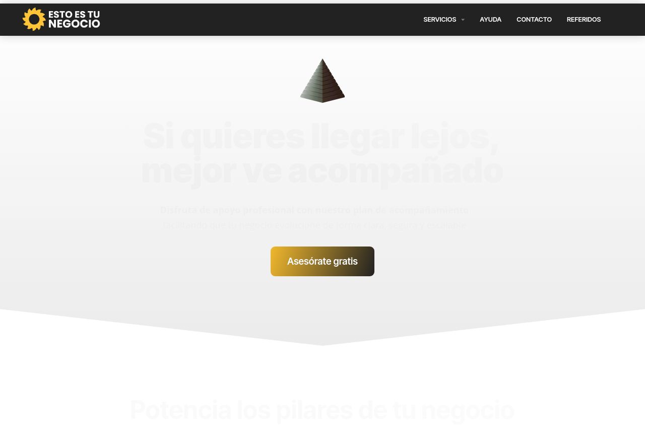
Disfruta de apoyo profesional con nuestro plan de acompañamiento facilitando que tu negocio evolucione de forma clara, segura y escalable

Summary:
This landing page attempts to convey professionalism but ultimately lacks clarity and structure.
The value proposition is vague, making it difficult for visitors to understand what exactly is being offered. Visual elements like the call to action button, "Asesórate gratis," are present but not compelling enough due to poor placement and lack of strong action words. Typography is consistent, but the layout is confusing and doesn't guide the eye properly down the page.
Visually, the page uses a dark and gold color scheme, which can convey elegance but might also come off as uninviting if not executed properly. The content feels cluttered, especially with text-heavy sections, and images used are not directly supporting the content. Overall, improved section headers and more precise messaging could significantly boost the engagement of the page.
- Clarify the main value proposition to better communicate what the service is actually offering.
- Improve the CTA button text to make it more action-oriented and relevant, e.g., "Start Your Free Consultation Now."
- Optimize the placement of CTAs throughout the page to improve actionability and conversion rate.