fireforge.me
Landing Page Analysis
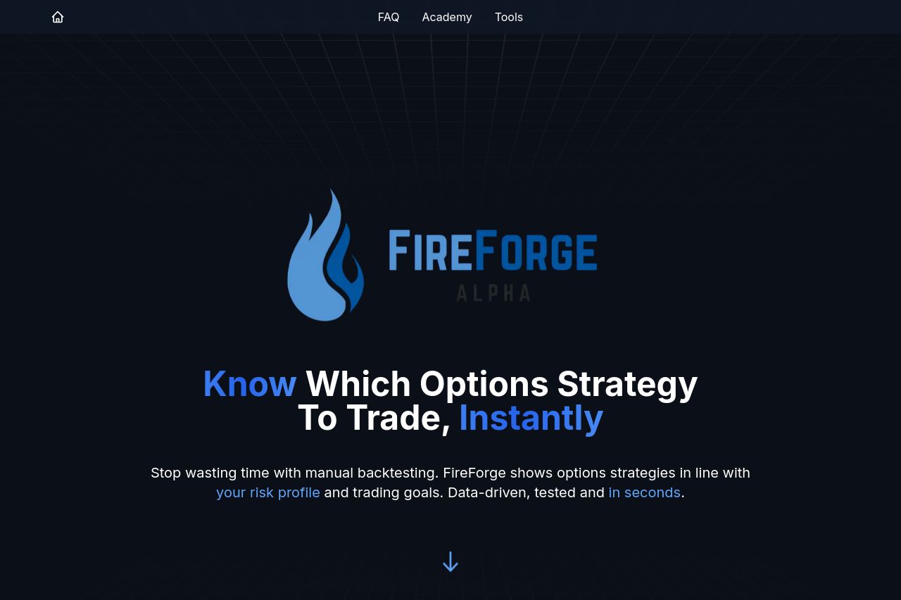
FireForge Options Explorer helps traders find the best SPX options strategies using 12+ years of data. Get instant strategy recommendations and improve your trading decisions.
Summary:
The landing page for FireForge Options Explorer does a decent job of targeting traders with a modern, dark-themed design that conveys a sense of sophistication. The overall messaging is somewhat clear, though there's a lack of specific, convincing details that traders crave, like real-world testimonials and in-depth case studies. Visual hierarchy is achieved through color and font size contrasts, but the overall layout feels a bit generic and doesn’t necessarily stand out in the crowded financial tools space. The call-to-action buttons are well-placed but lack urgency or a unique selling proposition to incentivize immediate action. The use of a consistent dark theme with blue highlights is appealing, yet it also risks blending in with many similar financial websites. There's a professional feel to the site, yet it's missing those trust-building elements crucial for credibility—such as clear social proof or detailed company background.
- Enhance the value proposition with concrete examples or testimonials showing successful trades using FireForge.
- Add more engaging and urgent call-to-actions to drive conversions, such as offering a limited free trial with unique features.
- Incorporate more personal elements like founder stories or user success stories to build trust and relatability.