studyfox.pro
Landing Page Analysis
Transform your learning experience with StudyFox's AI-powered tools. Access smart flashcards, quiz solving, mind mapping, and more. Start your 3-day free trial today at studyfox.pro
Summary:
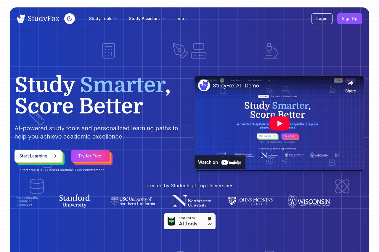
Overall, StudyFox presents a visually appealing design with a professional look, making a strong first impression. The color scheme and clean layout contribute to its readability. However, the messaging can be more targeted, and the CTAs need more precision.
The value proposition needs to be clearer. The phrase "Study Smarter, Score Better" is catchy, but it doesn’t explicitly explain what StudyFox is about. While AI-powered tools are mentioned, specifics could be better highlighted to make the page more engaging.
The design and navigation are decent, offering a clear flow of information from features to testimonials. Yet, some headings lack contrast, impacting readability on certain sections.
Credibility is well-managed with testimonials from students of recognized universities, though trust elements like badges or verified logos are missing, which could enhance trust further.
The actionability of the page is average. CTAs like "Try for Free" are present but lack a strong sense of urgency or clear benefit, which may lead to lower conversions. Moreover, the presence of multiple CTAs could confuse users.
Improvement in messaging alignment specifically for the student audience would enhance overall engagement, and a few targeted changes in CTAs and credibility could boost conversions.
- Make the value proposition clearer and tie it directly to student benefits.
- Introduce verified trust badges to enhance credibility.
- Refine CTAs to be more action-oriented and urgent.