codeclic.com
Landing Page Analysis
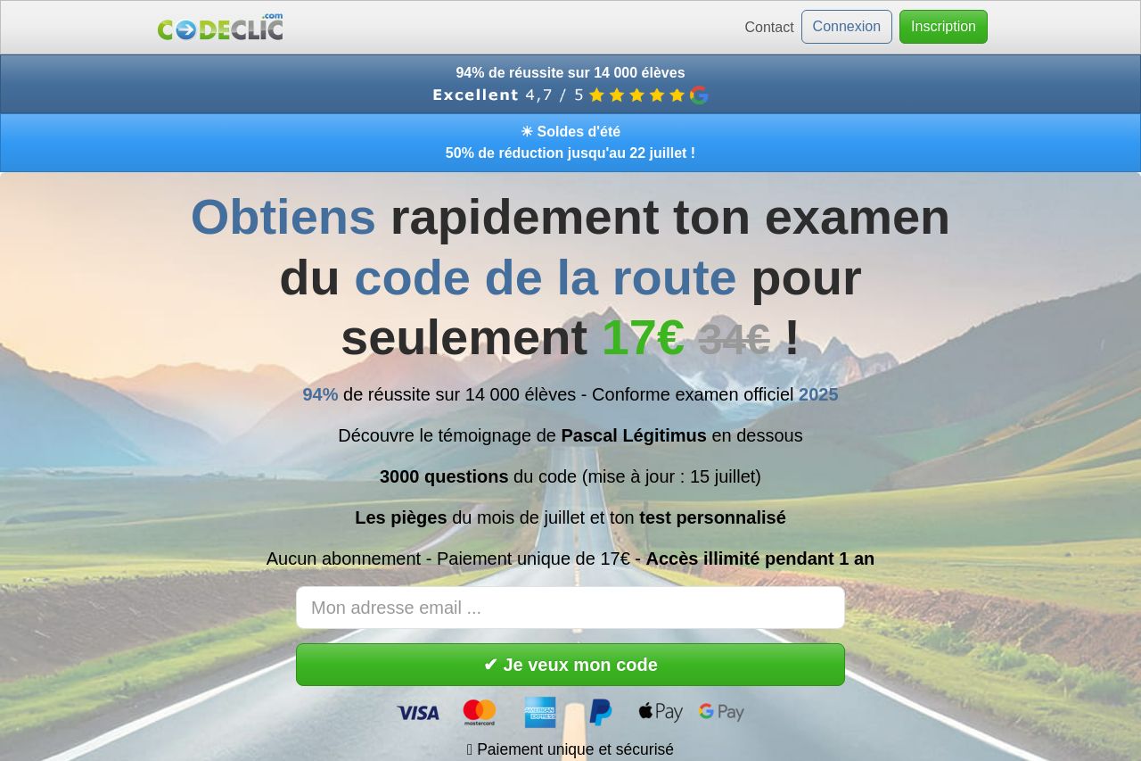
Obtiens facilement et rapidement ton examen du code de la route grâce à 3000 questions conformes à l'épreuve officielle 2025 !
Summary:
The landing page does a good job of immediately capturing attention with a strong headline and competitive pricing offer. The use of the word "seulement" enhances the value proposition by emphasizing affordability. However, the design is cluttered, with too many elements competing for attention. The placement of the testimonial video feels awkward and disrupts the flow. The call to action buttons are not as prominent or compelling as they could be, potentially reducing conversion rates. Social proof is abundant, which builds trust, but inconsistent styling across sections makes the page seem disjointed. The color scheme is quite all over the place, making it hard for key messages to stand out. Adding to the mess, there’s a misalignment in hierarchy—important info is scattered, and less crucial visuals draw disproportionate attention.
- Improve the visual hierarchy by ensuring key sections like the CTA and benefits are more prominent.
- Simplify the design by reducing clutter and ensuring consistency in typography and color scheme.
- Reposition or redesign the testimonial video placement for better flow.
- Enhance CTA visibility and improve the action-oriented language.