com.au
Landing Page Analysis
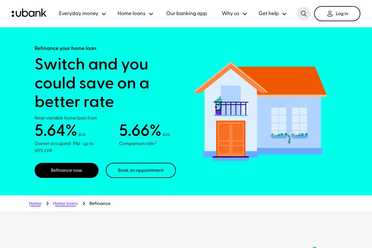
Switch your home loan with ubank and save on your repayments with a better rate.
Summary:
Strong design elements are evident throughout the page, with good use of whitespace and effective visuals, but some areas could use a stronger focus on clarity and hierarchy. The messaging is fairly solid, emphasizing the benefits of refinancing and making the process appear simple and streamlined. However, the CTAs could be more prominent, with clearer action-oriented texts. The structure is logical, with information flowing well from introduction to engagement. Credibility elements like logos and partnership mentions are available, but are a bit understated in their presentation. The Open Graph image does not align well with the content and may not draw sufficient attention for social sharing.
- Enhance CTA visibility and ensure clarity in language.
- Improve Open Graph image to better represent refinancing content.
- Increase emphasis on credibility elements like customer testimonials.