arabdreams.com
Landing Page Analysis
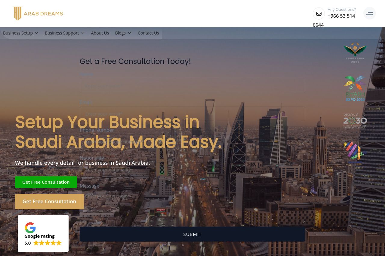
We handle every detail for business in Saudi Arabia.

Summary:
Overall, the landing page aims to convey a professional image, but it ends up missing the mark in many areas. The value proposition isn't clearly communicated, leaving potential clients to wonder why exactly they should choose this service over competitors. The tone attempts to be formal and business-like but often becomes too generic, which does not engage the reader effectively.
The readability could be much better. The use of text could be more straightforward, avoiding long paragraphs. Inconsistent typography and cluttered design elements make reading a chore rather than a streamlined experience.
Design-wise, there's a lot going on, and not in a good way. The elements are not appropriately aligned, and poor use of visual hierarchy leads to confusion. The inconsistent color scheme distracts rather than focuses attention.
Structurally, the content jumps from one section to another with little logical flow. The essential information isn't prioritized, buried under overly complicated language without introduction of clear benefits upfront.
The call-to-actions are everywhere and nowhere. They blend into the background and are ambiguous, making the user experience frustrating rather than compelling.
On the positive side, the credibility aspect is managed reasonably, with several testimonials and some degree of transparency with contact information.
- Simplify the language to improve readability and clearly define your unique selling points.
- Organize content to create a logical flow, making sure key information is easy to access.
- Enhance design consistency through color and typography to improve user engagement.
- Ensure CTAs are clearly visible, action-oriented, and effectively placed throughout the page.