co.uk
Landing Page Analysis
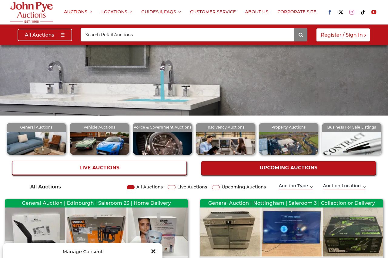
General Auctions Vehicle Auctions Police & Government Insolvency Auctions Property Auctions Businesses For Sale
Summary:
The website feels overly crowded and busy, detracting from usability. The homepage is a visual overload with too much information crammed into small spaces. Sections for different auctions are packed tightly, leading to confusion. The use of color is not balanced well, and the site's consistency wobbles with varying button designs. On a positive note, the site does provide a vast amount of information and options for filtering auctions. However, the repetitive consent box is annoying and interrupts the user experience too frequently. The site's credibility is strong due to its established nature, but it could lose potential users due to the overwhelming layout.
To sum it up, the site is both informative and daunting. While it offers a lot of content, it lacks the organization and clean navigation that would make it truly user-friendly.
- Simplify the layout to enhance user experience.
- Reduce the frequency of the consent box appearance.
- Balance color usage for better visual distinction.