kanan.co
Landing Page Analysis
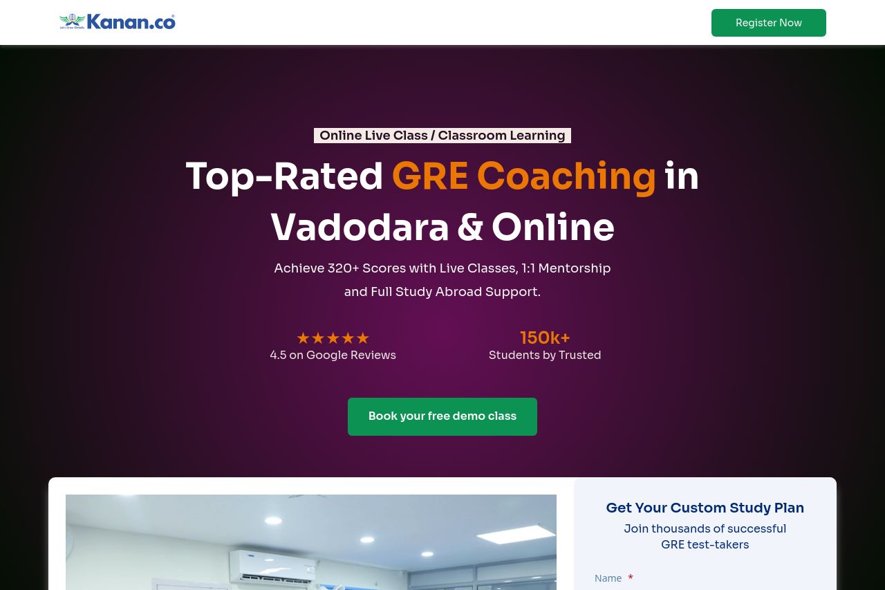
Achieve 320+ Scores with Live Classes, 1:1 Mentorship
Summary:
The landing page is generally well-organized and visually appealing, but there are significant areas for improvement. The value proposition and benefits are fairly clear, but some sections feel overwhelming due to large text blocks and lack of breaks. The page uses icons and images well, but some of the CTAs could be more compelling. Although testimonials add credibility, some sections are cluttered, which distracts from the intended focus of the page. The color scheme complements the overall design but fails to create strong visual hierarchies in certain areas. The attempt to include comprehensive information is appreciated, yet it comes at the expense of simplicity and directness. Adjustments in these areas could make the landing page significantly more effective for the target audience.
- Simplify the text in several sections for better readability.
- Improve the visual hierarchy of the page by differentiating font sizes and weights.
- Craft more action-oriented CTA texts that stand out and compel users to act.