hkcarpets.com
Landing Page Analysis
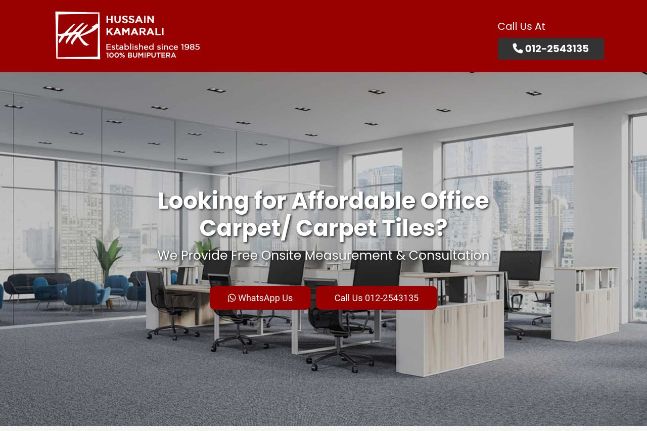
We Provide Free Onsite Measurement & Consultation
73
Share on:
Summary:
80
Messaging
65
Readability
75
Structure
60
Actionability
60
Design
80
Credibility
The page provides a comprehensive overview of carpet and flooring options, catering well to the target audience with visuals and descriptive text. However, it suffers from monotonous design choices, such as repetitive colors and layouts, which can affect user engagement. The navigation could be smoother, and the call-to-actions are somewhat lost in the content, reducing their effectiveness. Although the website contains testimonials and clear service descriptions, the overall lack of visual differentiation leaves it feeling dull and uninspired despite the wealth of information provided. It's solid in content but needs a serious boost in visual appeal and navigational clarity.
Main Recommendations:
- Enhance visual hierarchy by using different font sizes and weights.
- Improve CTA visibility with distinct colors and placements.
- Introduce more varied color schemes to create visual interest.