unsubby.com
Landing Page Analysis
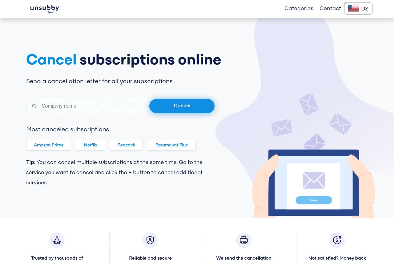
Unsubby is the solution to cancel all your subscriptions. Quickly find the company you want to cancel and save time and money.
Summary:
Unsubby's landing page provides a straightforward solution for canceling subscriptions online. The main value proposition is clear, with a clean design focusing on functionality. However, some design elements lack strong visual hierarchy and the call-to-action (CTA) could be more engaging. The use of testimonials builds trust, but the layout could benefit from better organization and emphasis on key information. The steps for canceling subscriptions are presented clearly, yet the overall tone and text simplicity need refinement for broader appeal. Consistency is solid, but some design enhancements could improve the user experience.
- Enhance the visual hierarchy and focus by increasing the contrast and size of key sections.
- Revamp the CTA to make it more engaging and prominent with action-oriented text.
- Simplify the text and tone to make it more approachable for a broader audience.