prismia.be
Landing Page Analysis
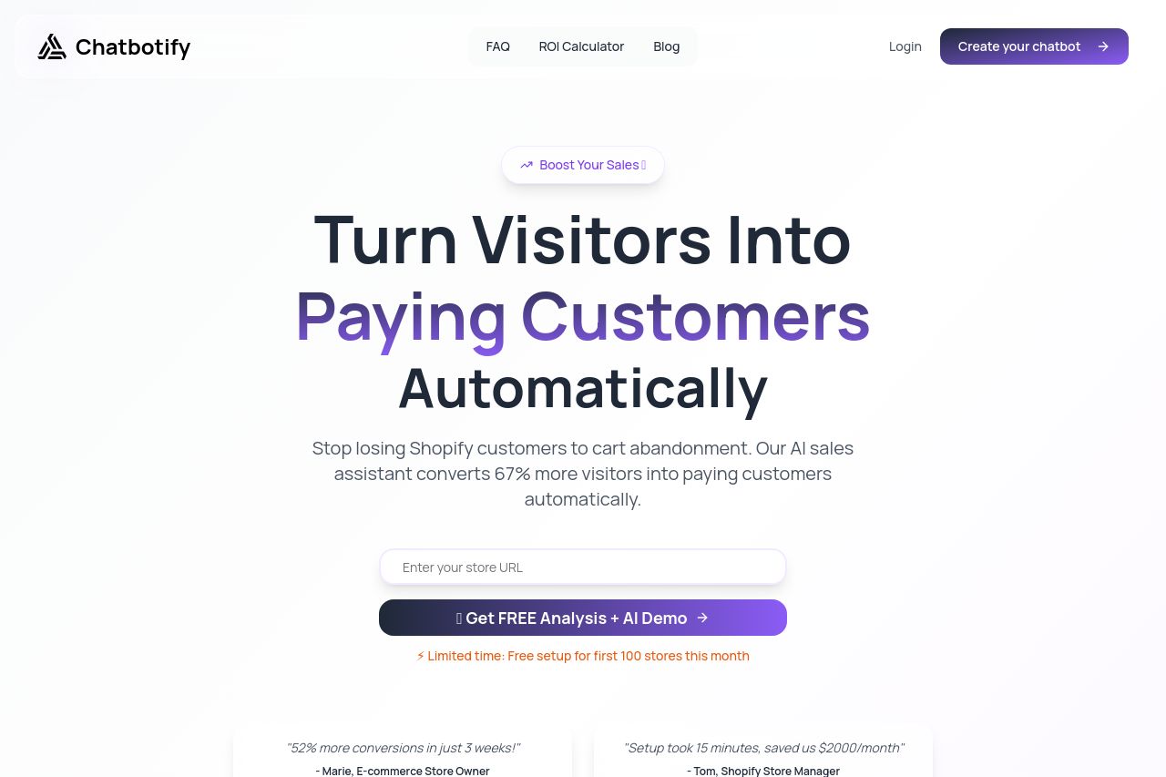
Create your AI chatbot in 15 minutes and double conversions. Limited time offer to boost your Shopify sales.
67
Share on:
Summary:
70
Messaging
65
Readability
65
Structure
50
Actionability
60
Design
70
Credibility
The page hits some high notes but trips on crucial details. Great use of color and clear targeting make it appealing to Shopify users right from the start. However, the excessive text in some sections bogs down the message, making it harder for visitors to latch onto the main points. Visuals and design consistency are mostly strong, but some CTAs don't stand out as much as they should. While credibility elements like testimonials and security badges are there, the overall layout could flow better to lead the visitor more naturally through the content.
Main Recommendations:
- Increase the prominence of CTAs to stand out more against the background.
- Simplify heavy text sections to improve readability and engagement.
- Reorganize content for a more logical flow, ensuring key messages aren't buried.