mobilenewz.co
Landing Page Analysis
We value your privacy
38

Share on:
Summary:
30
Messaging
50
Readability
40
Structure
35
Actionability
40
Design
20
Credibility
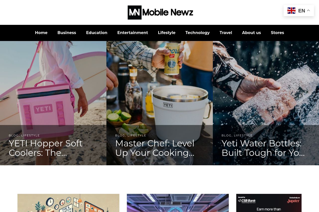
Mobile Newz lacks clarity and focus in its initial presentation. The blog categories at the top are somewhat organized, but the overall layout is cluttered with too many images that compete for attention. The visuals are decent, but the lack of consistency and hierarchy in font sizes and weights dilutes the impact of headings. Ads are intrusive, disrupting viewer attention from the main content. There is a noticeable absence of clear calls to action or engaging introductory content, leaving new visitors unclear about the site's purpose or main offerings.
Main Recommendations:
- Reduce ad clutter and make them less intrusive.
- Clarify and highlight a main value proposition in the hero section.
- Use consistent typography to improve visual coherence.