flyflightnow.com
Landing Page Analysis
Verify you are human by completing the action below.
15

Website:
https://flyflightnow.comGenerated on:
July 8, 2025Score:
15/100Audience:
'old People' 'people looking to book flights'Share on:
Summary:
10
Messaging
55
Readability
10
Structure
0
Actionability
0
Design
10
Credibility
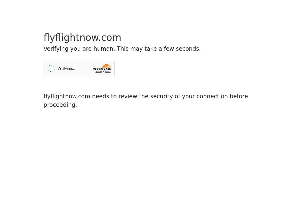
A frustrating experience right from the start! The page prioritizes security verification, which is fine, but the entire message is void of any branding, engaging elements, or value proposition. It feels like a brick wall rather than a welcome mat. For a service targeting users who might already be stressed or impatient looking for flights, this lack of welcoming interface only heightens frustration. Frankly, it feels more like an error page than a landing page.
Main Recommendations:
- Show a branded element or logo at the top to reassure users they are in the right place.
- Include a brief, welcoming message or some enticing teaser about what they will find next to the captcha verification.
- Add some design elements to give the page a bit of character and reinforce security elements without making the page appear broken.