setaply.com
Landing Page Analysis
Setaply is a CRM integration and automation agency helping businesses streamline operations with powerful CRM solutions and seamless integrations.
Summary:
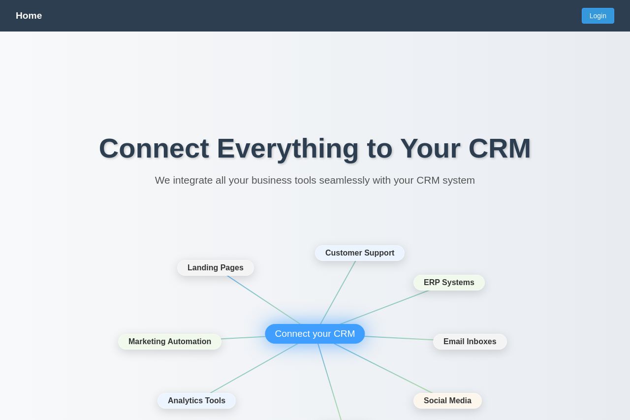
The landing page lacks impact and visual interest. The value proposition, "Connect Everything to Your CRM," is straightforward but lacks specificity and persuasion. The layout is overly simplistic, and the diagrams used seem basic and uninspired. The call to action is clear but lacks urgency or a compelling reason to act immediately. The "Book Consultation" button is the only notable action point, but it's surrounded by a vague CRM selection graphic that doesn't offer much guidance. This could lead to user frustration. The overall design feels bare and lacks the polished professionalism expected for marketing agencies, with too much reliance on standard font and layout choices. Social proof and credibility are also weakly communicated, missing recognizable logos or trust badges.
- Enhance the design with more engaging visuals and interactive elements to capture user attention.
- Add specific details of integrations or use-cases to clarify the offering and resonate with the audience.
- Incorporate social proof elements like client logos or testimonials to build trust.
- Improve the visual hierarchy by making the CTA more prominent and appealing.