vercel.app
Landing Page Analysis
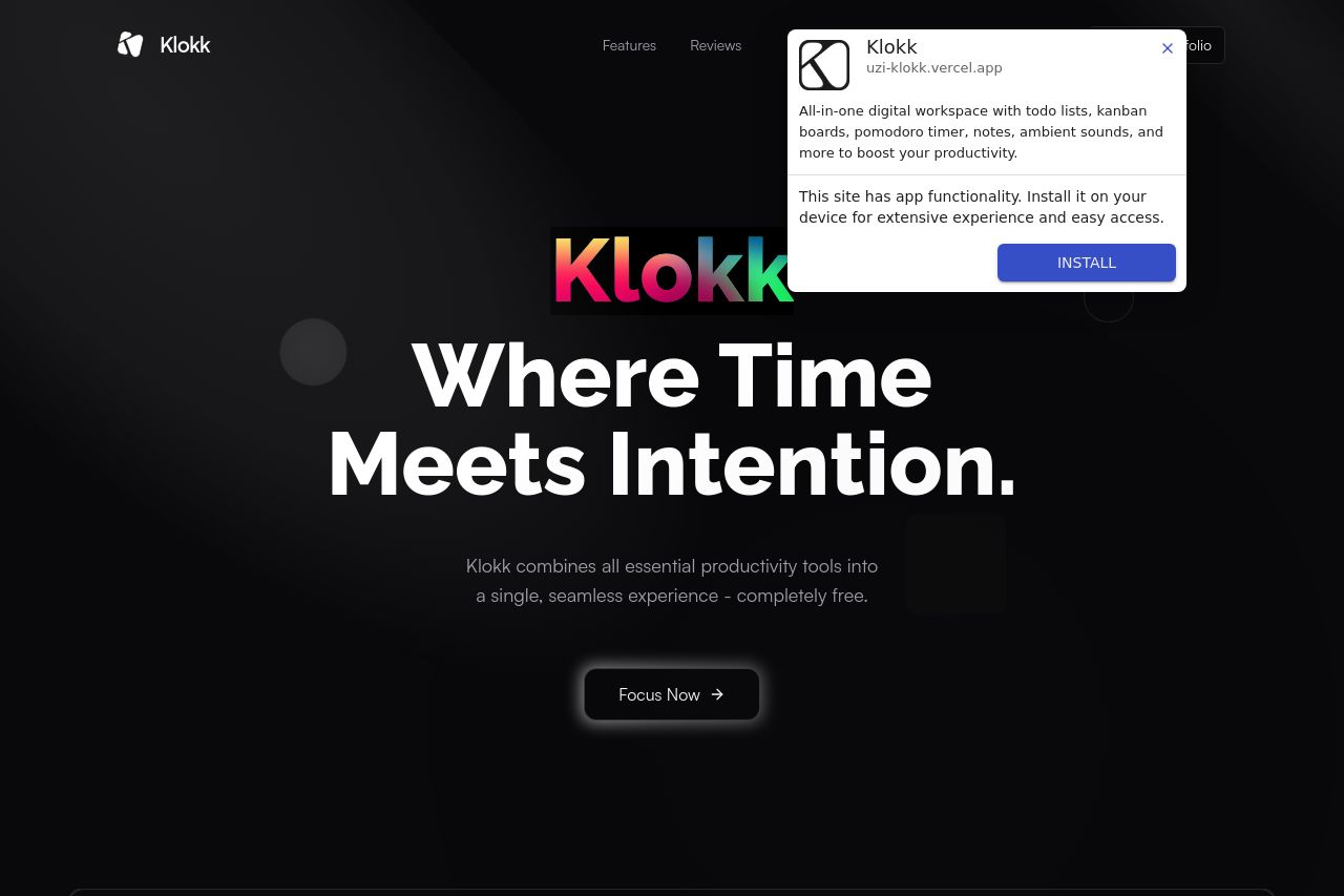
All-in-one digital workspace with todo lists, kanban boards, pomodoro timer, notes, ambient sounds, and more to boost your productivity.
Summary:
The landing page for Klokk looks visually appealing with its dark theme and vibrant touches, which is a nice balance. The hero section is strong with a prominent headline, "Where Time Meets Intention," and a clear, if somewhat lofty, value proposition. However, the messaging could be too abstract for users who are seeking straightforward reasons to use the service. The features section does well to list out tools, presenting a clear overview for potential users, although the repetitive design choice might feel monotonous and uninspired. The website's readability is largely decent, though some of the graphic text is slightly hard to discern against the dark backdrop, especially in finer font sizes. Credibility is clearly improved by the presence of user testimonials, though they could appear more persuasive if they were matched with more context or visuals. The call-to-action buttons have good positioning and visibility, providing an easy next step for users who are engaged.
- Clarify the value proposition to better explain the product's unique benefits.
- Enhance visual hierarchy in typography for improved readability.
- Add more visual elements to differentiate features and avoid monotony.