annkroeker.com
Landing Page Analysis
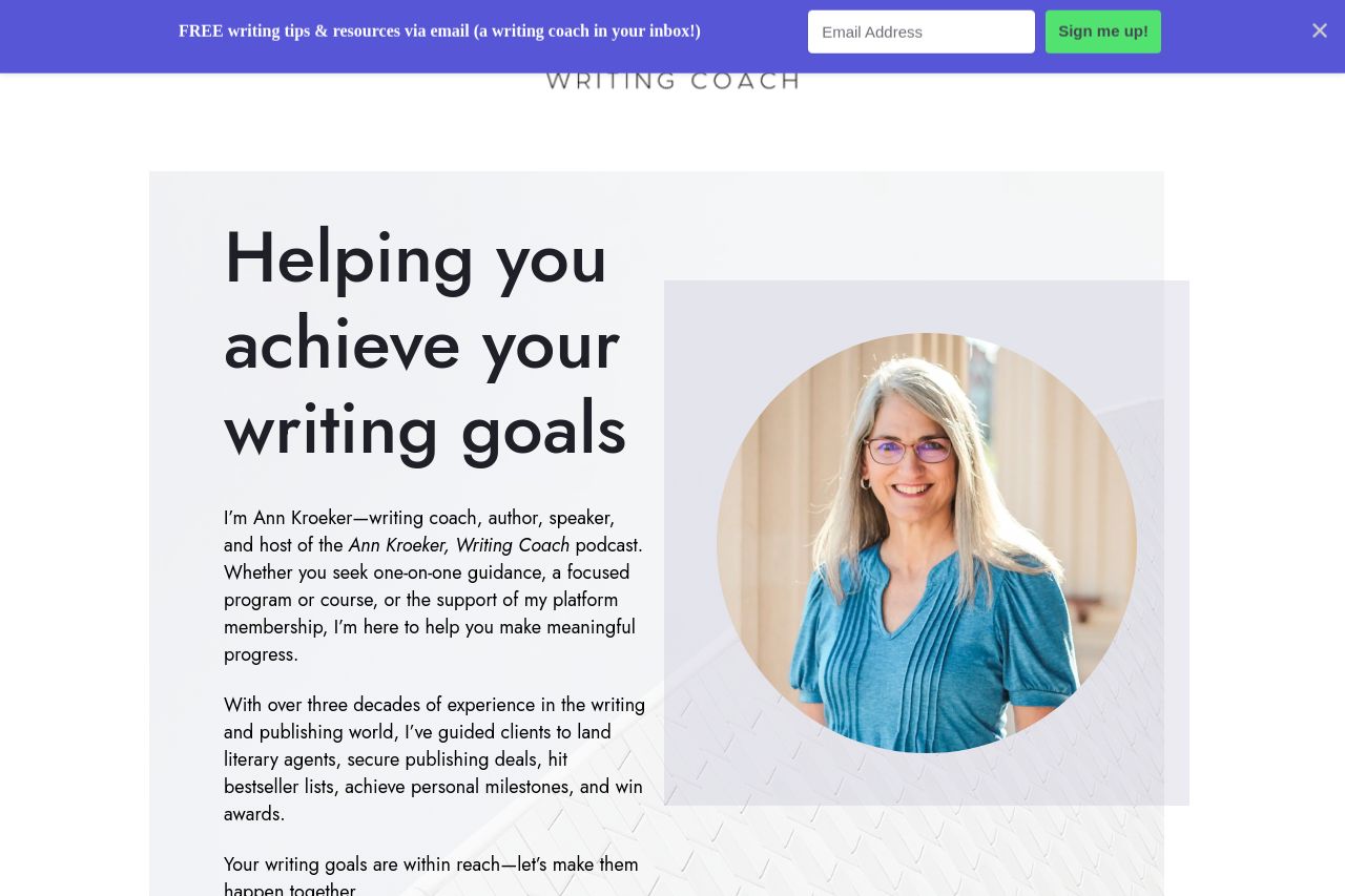
I’m Ann Kroeker—writing coach, author, speaker, and host of the Ann Kroeker, Writing Coach podcast. Whether you seek one-on-one guidance, a focused program or course, or the support of my platform mem
Summary:
The landing page for Ann Kroeker presents a professional and inviting space for writers seeking guidance. The use of color is consistent, providing a calming effect, but it lacks some vibrancy to catch the eye, especially in CTAs, which blend into the rest of the content, failing to stand out. While the messaging is clear, it could benefit from being more concise and direct; there’s a bit of information overload that might deter some users. The value proposition is strong, though somewhat buried, reducing its initial impact. The layout is clean and well-organized with effective use of whitespace, yet certain sections feel a little monotonous, lacking dynamic visual elements that could enhance engagement. Credibility is enhanced by testimonials and featured publication logos, but there’s room for more distinctive branding that showcases unique selling points earlier on the page. Overall, the website delivers a reliable message but doesn't immediately grab attention.
- Enhance CTA visibility by using a contrasting color and larger font size to draw more attention.
- Simplify the messaging by shortening paragraphs and using bullet points for quick reading.
- Highlight unique selling points earlier in the page to capture attention immediately.