rocketmoney.com
Landing Page Analysis
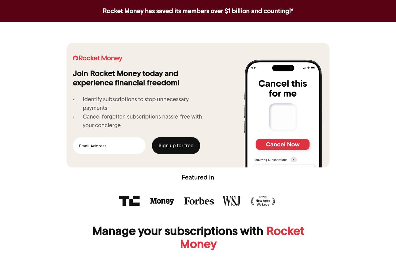
Rocket Money identifies your subscriptions to help you stop paying for things you no longer need. Your concierge is there when you need them to cancel unwanted subscriptions so you don’t have to.

Summary:
The Rocket Money landing page does a decent job at conveying the key benefits of the service, especially by showcasing substantial achievements like saving members over $1 billion. The value proposition is prominently reiterated, helping to communicate the core offering to the users. However, repetition of the same content across sections and lackluster visuals can make the page feel uninspired. The CTA elements are visible but lack a strong sense of urgency or action-oriented language. The color scheme and typography work well together, but they are quite dull, lacking the dynamism that could enhance user engagement. Logos of reputable publications lend credibility but could be more effectively integrated into the design to enhance trust without clutter.
- Revamp the CTA language to make it more action-focused, such as 'Unlock Your Savings' instead of 'Sign up for free'.
- Avoid content repetition between sections to keep the reader engaged and avoid redundancy.
- Incorporate more visually engaging elements or interactive demos to break monotony and enhance user engagement.