selllikecrazybook.com
Landing Page Analysis
Possibly The Most Controversial Marketing And Sales Book For The General Public Ever Written...
Summary:
The page is a classic hard-sell landing page with a lot of urgency and scarcity tactics.
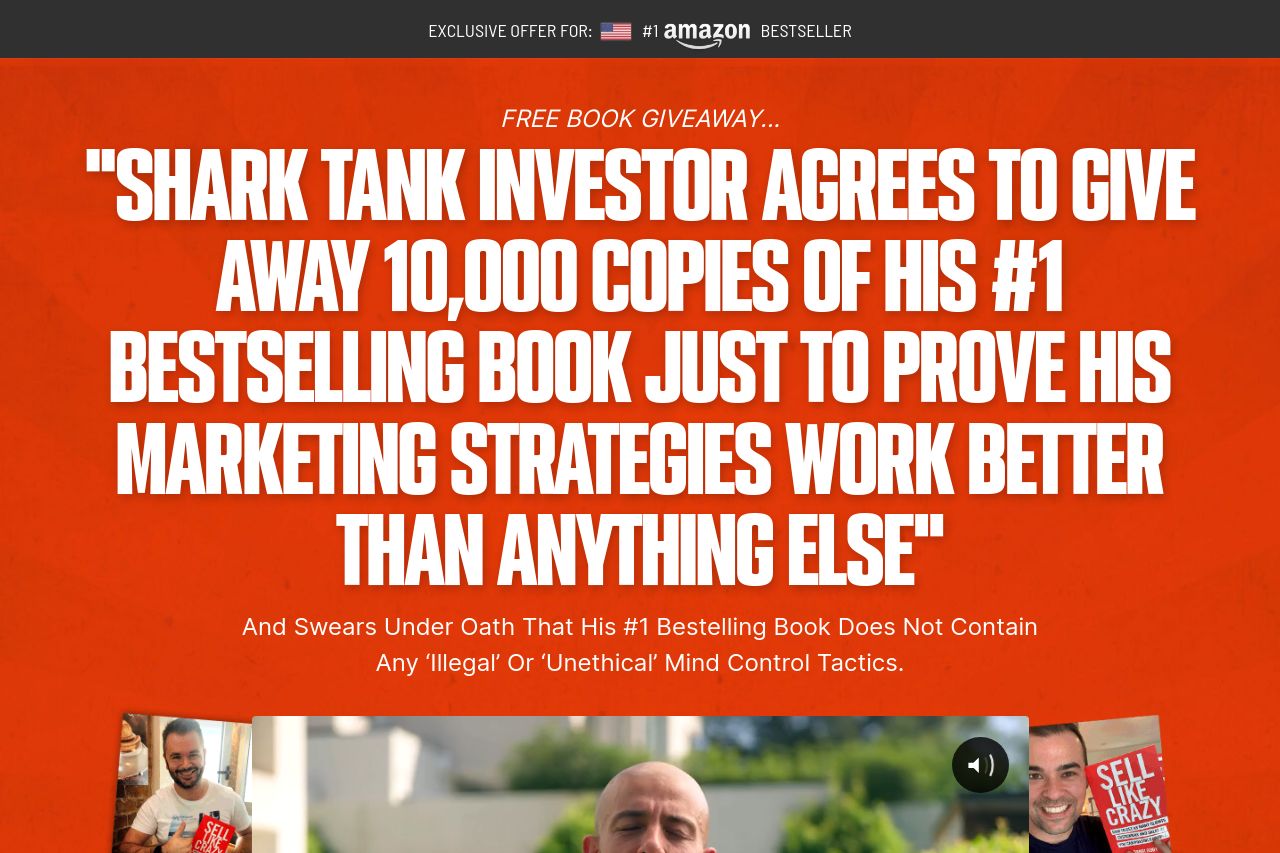
The headline on the hero section is bold and emphasizes a "Shark Tank Investor" but feels overly hyped and a bit too exaggerated. It might catch attention, but could also deter skeptical visitors. The bright red color scheme is aggressive but reinforces urgency.
The use of social proof is strong, with recognizable brands and multiple testimonials from known figures. However, the wall of text and testimonials could turn people off due to information overload. The typography is fairly clear but tends to be aggressive, with excessive use of capital letters, bold text, and red highlights.
The call to action is prominent but repeated too often, which can become overwhelming. The "Rush Me A Free Copy" button stands out, but the scarcity tactics and stock limitations seem forced.
The content is tailored towards budding entrepreneurs but is somewhat generic, and the promises seem overly ambitious. While the tone is informal and engaging, it's almost too casual, which might not resonate with all professional readers.
Despite the aggressive marketing approach, the page could benefit from more focus on subtle persuasion rather than repetitive hard-sell tactics.
- Reduce the amount of repetitive text to avoid overwhelming visitors.
- Shift some focus to features and benefits rather than just bold claims.
- Balance the color scheme to allow a better readability.