mykajabi.com
Landing Page Analysis
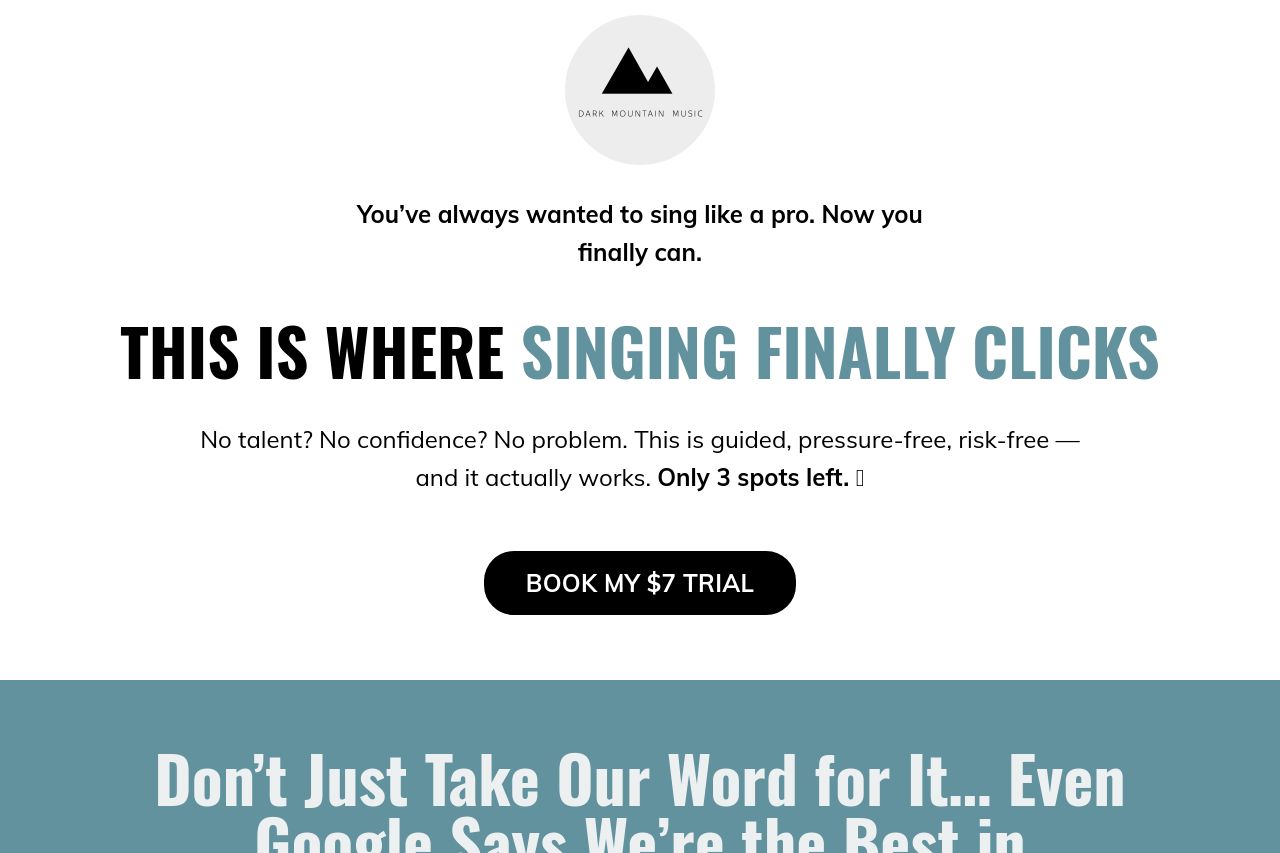
You’ve always wanted to sing like a pro. Now you finally can.
Summary:
This landing page is doing a decent job at engaging potential customers with a strong headline, but it's a bit of a mixed bag. The value proposition stands out but feels repetitive and could be more concise. Audience alignment is decent, targeting those lacking confidence or experience in singing. The tone is engaging and relatable, capturing the voice of someone who understands the doubts of novice singers.
Readability is good on shorter sections, though longer paragraphs are too dense. The typography is consistent, but text blocks occasionally lack adequate visual breaks. The design uses hierarchy well, with the prominent headline and call-to-action button. Some sections, however, could benefit from more variation in text size and color to guide the reader better.
The structure is where this page falls short. Lengthy text without immediate value makes scanning a chore. CTAs are well-placed but a bit generic, missing a sense of urgency. Lastly, the credibility section is mostly solid, with testimonials providing trust, but there's a lack of recognizable logos or partnerships to back it up fully.
- Streamline the value proposition to make it more concise and impactful.
- Break up long paragraphs into smaller, more digestible sections for better readability.
- Introduce more urgency or specificity in the CTA to motivate immediate action.