systeme.io
Landing Page Analysis
Elevate Your Food Brand with Authentic, High-Resolution Photography Perfect for Marketing and Social Media.
Summary:
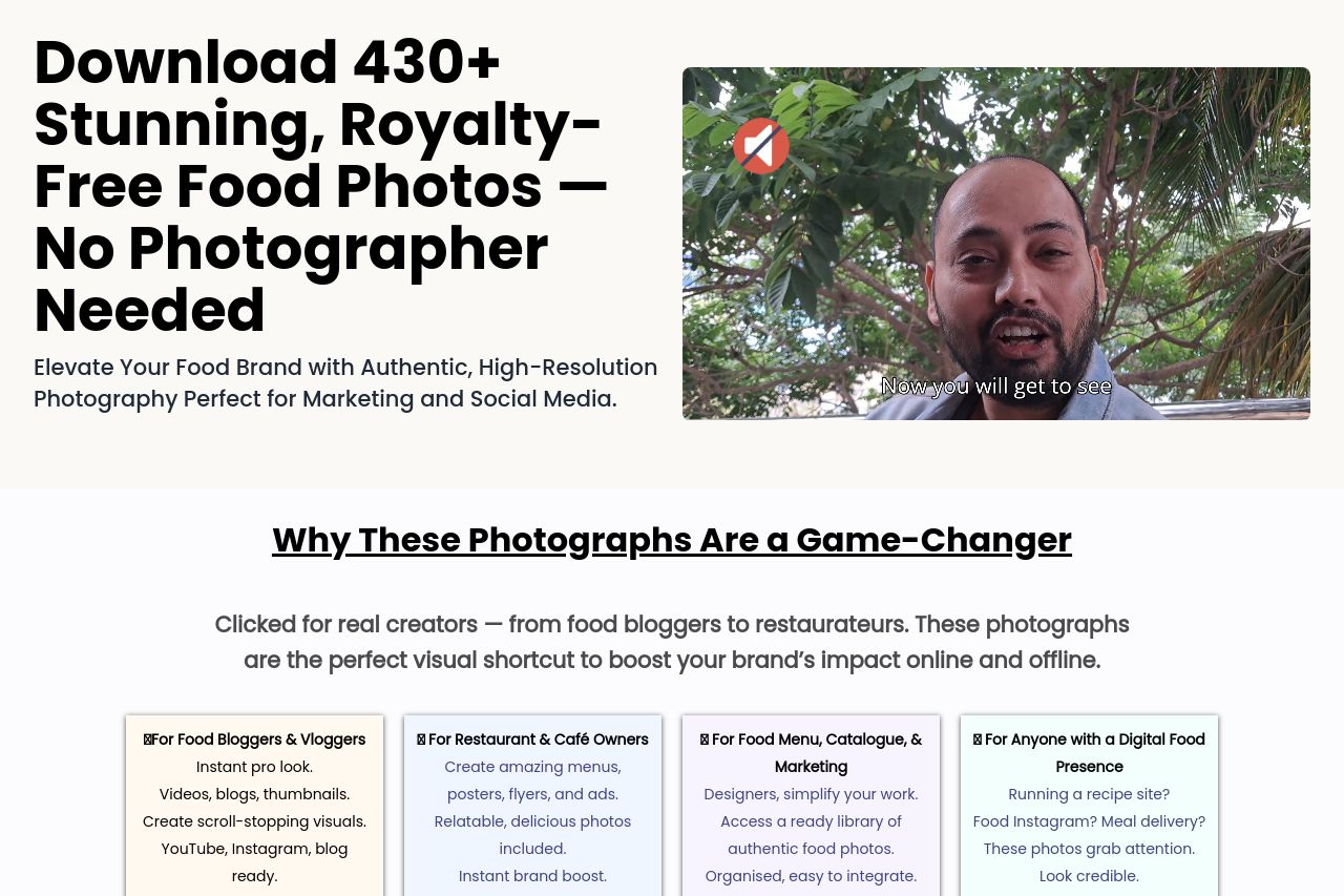
The landing page does a decent job presenting the food photo package, with clear headlines and straightforward benefits. However, the overall execution lacks polish and consistency. The hero section is eye-catching, but the embedded video appears to be broken or poorly integrated, reducing professionalism. The feature sections could use better alignment with audience needs—more tailored messaging and specific use cases would help. Design-wise, the page uses consistent fonts and colors, but it feels somewhat generic and doesn’t convey a strong brand identity. The call to action gets lost amidst the dull design, lacking urgency and appeal. Without strong social proof elements and credible signals, the page struggles to feel trustworthy.
- Enhance the CTA design with more contrast and urgency.
- Fix or remove broken video in the hero section for a professional look.
- Incorporate credibility elements like testimonials or client logos for trust building.