unsubby.com
Landing Page Analysis
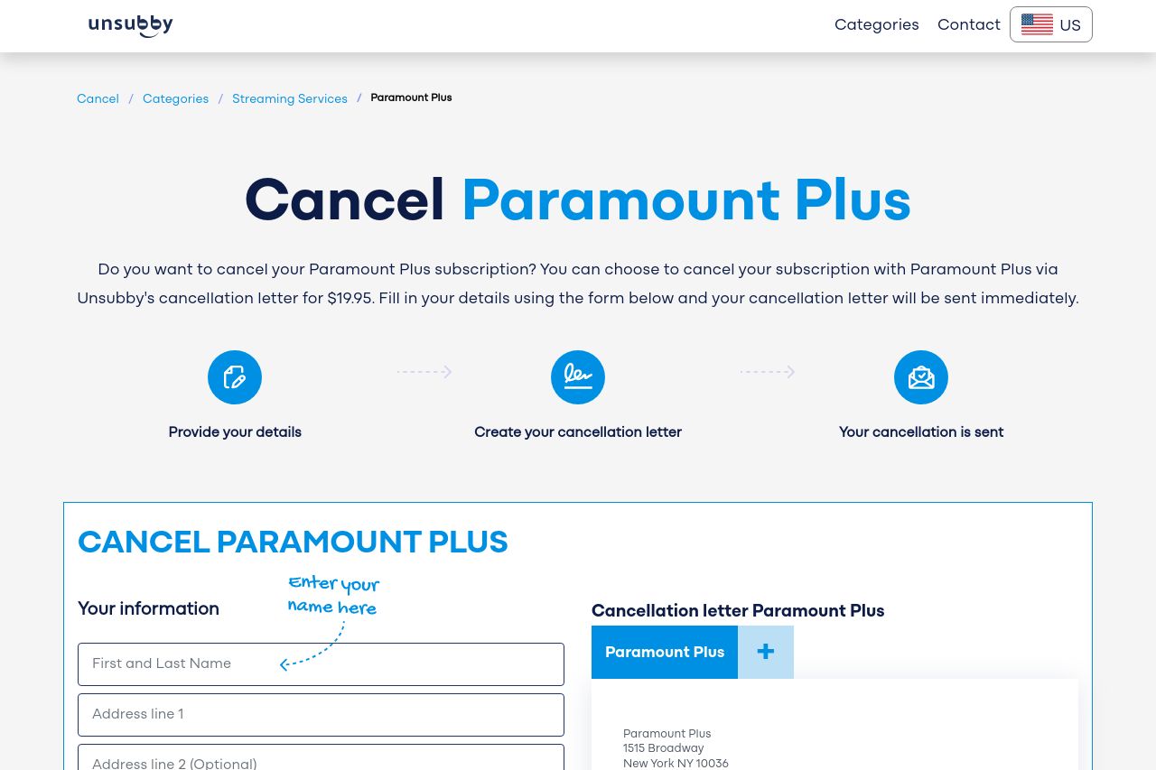
Cancel your Paramount+ subscription online in a few easy steps. Use our online cancellation letter or learn other ways to cancel your subscription.
Summary:
Overall, the landing page provides a straightforward guide for potential users to cancel their Paramount Plus subscription through Unsubby. The design is clean and easy on the eyes, with a clearly defined process outlined at the top. However, the page lacks a standout value proposition, making it hard for users to immediately grasp the benefits of using this service over cancelling themselves. The text can be overly verbose in some sections, potentially leading to disengagement. Visual hierarchy is somewhat maintained, but certain sections are overcrowded, especially the payment details, which could overwhelm the user. Moreover, the page tries too hard to establish credibility with reviews but misses a clear demonstration of security and reliability through more trust factors like badges or guarantees.
- Clarify and emphasize the value proposition to make the service's benefits more apparent.
- Simplify the payment section to reduce overwhelm and improve user trust.
- Enhance credibility with more trust factors like security badges.