thechefsidea.com
Landing Page Analysis
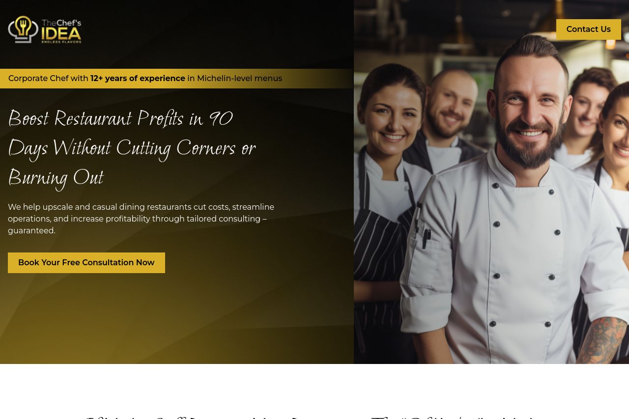
We help upscale and casual dining restaurants cut costs, streamline operations, and increase profitability through tailored consulting – guaranteed.

Summary:
The landing page does a decent job of highlighting the problem and offering a solution tailored to restaurant owners. The headline promises significant value but lacks specificity on urgency or uniqueness. The tone remains somewhat generic, despite some well-chosen emotional triggers like "bleeding cash." Visibility is slightly hindered due to the dark backgrounds blending with text, making readability harder. Images support the theme but aren't particularly striking and the layout lacks pop. The calls to action are well-placed but don't always stand out due to a lack of contrast and urgency in the color scheme. Trust elements are minimal, which might impact credibility.
While the messaging attempts to connect with restaurant owners, it sometimes dips into clichés. The structure follows a logical order, but some visual clutter could be trimmed to make the key points more impactful.
- Increase contrast between text and background for better readability.
- Enhance the visibility of CTAs with bolder colors or surrounding whitespace.
- Introduce stronger testimonials or recognizable client logos to boost credibility.
- Revise messaging to emphasize urgency and unique value propositions.