google.com
Landing Page Analysis
Book Your FREE Profit Analysis Now! Limited Time Offer
Summary:
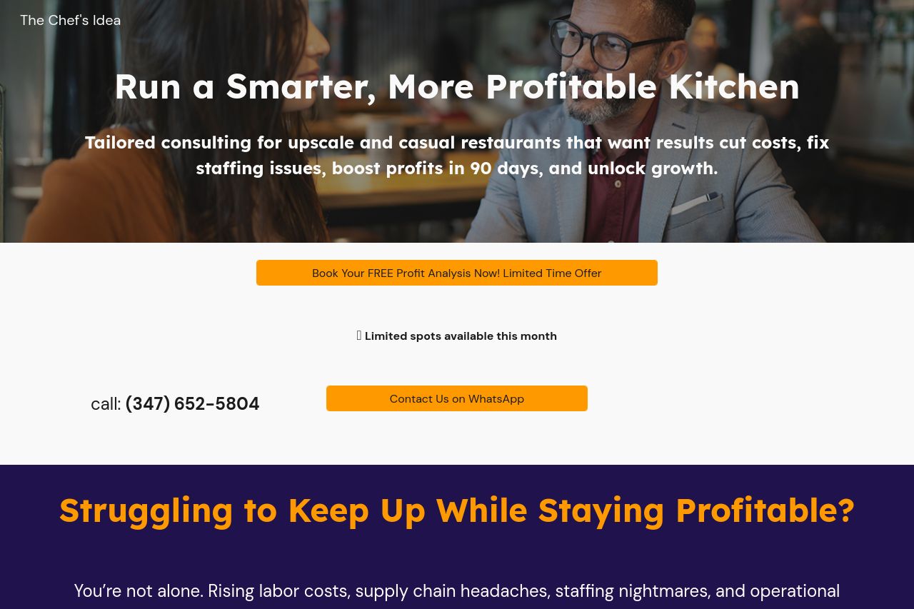
The landing page for "The Chef's Idea" offers some compelling elements, but it's laden with issues that need fixing. The headline clearly outlines a strong value proposition, but the overall messaging lacks clarity and alignment with the audience's precise needs. The structure is a bit cluttered with text-heavy sections that could scare away readers.
Readability suffers from typography that's somewhat difficult to manage, with inconsistencies in font sizes and colors adding to the confusion. The design choices lack cohesion; the visual hierarchy is muddled, making navigation a challenge. While the color scheme is somewhat aligned with the target audience, it fails to make a distinctive impression.
On a positive note, credibility is bolstered by testimonials and a promise of personalized service. However, the contact information is sparse, affecting transparency and trust. Call-to-action placements are fairly well-placed yet lack the punch needed to compel action. Overall, the page has potential, but it requires a clean-up across various fronts to truly excel.
- Clarify and streamline the value proposition to focus on core benefits.
- Improve typography by standardizing font sizes and styles for consistency.
- Enhance CTA text to drive more action with clear, strong verbs.
- Add more visuals to break up text-heavy sections and maintain interest.
- Ensure better contrast between text and background for easier readability.