darkmountainmusic.com
Landing Page Analysis
Learn to sing with Dark Mountain Music’s private singing lessons in Edmonton. Pro Instructors. All-Ages + Skill Levels. No Contracts.
Summary:
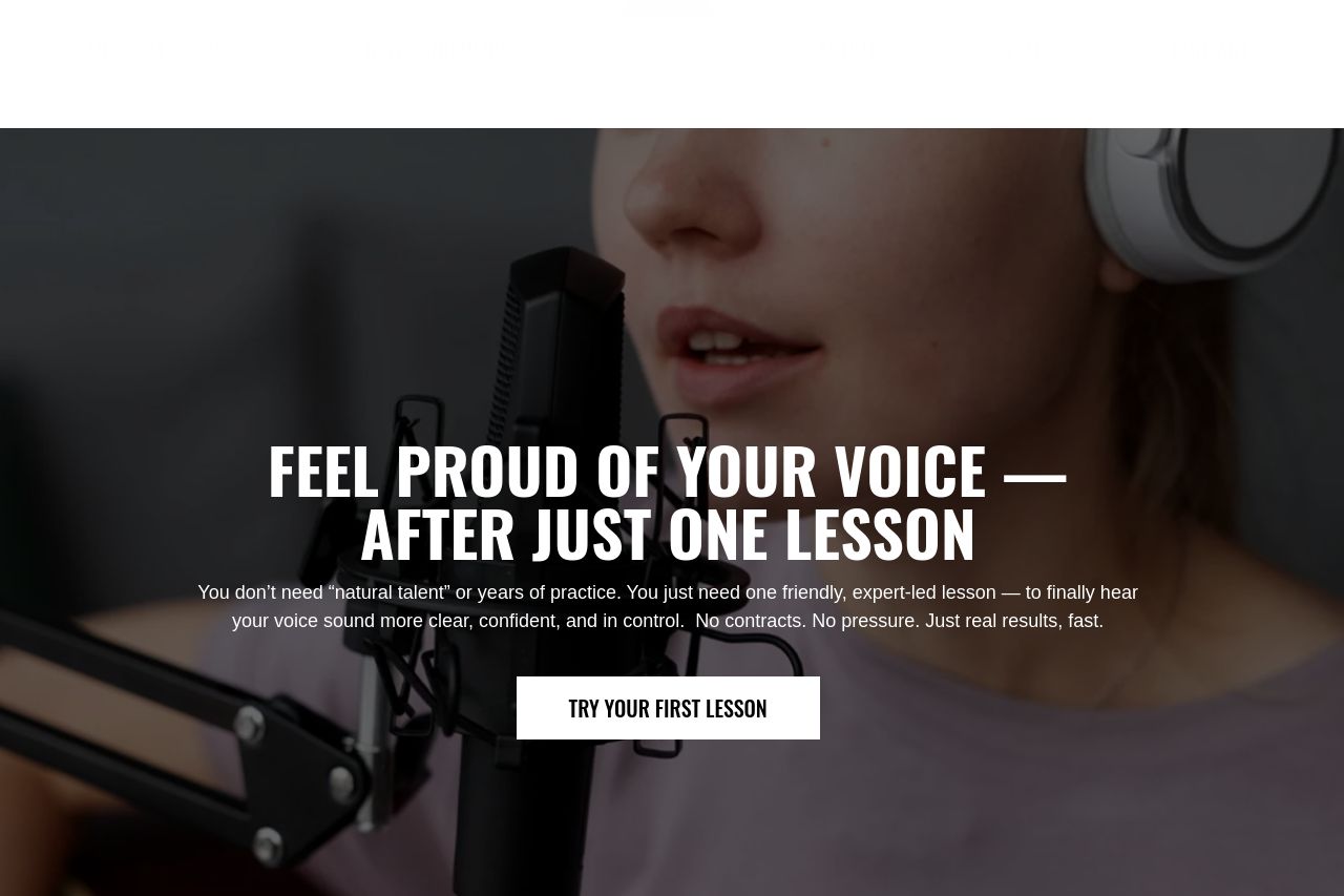
The landing page does a good job of presenting singing lessons in an engaging way. The headline "Feel Proud of Your Voice After Just One Lesson" is bold and directly speaks to the potential customer’s desires. The accompanying text builds on this effectively, highlighting the ease and comfort of the lessons. The repeated 'Try a Lesson' call to action is prominent, gravitating towards actionability.
However, some flaws are dragging down its potential. The testimonials are visually overwhelming and need a more refined layout to enhance reading flow. Some sections are stuffed with text, like in "Why Adults Choose Us," where the benefits could be more concisely listed. Also, CTAs are too frequent, leading to potential decision fatigue.
The design is consistent but borders on bland with its black and white theme. Additionally, the explanations of pricing plans aren't particularly enticing. They state facts but lack persuasive language or urgency. Visuals are sparse outside the hero section; more relevant images or illustrations related to singing could make the page more engaging.
- Simplify the text in 'Why Adults Choose Us' to improve readability.
- Enhance the design with more engaging colors or images related to singing.
- Revise pricing plan descriptions to add persuasive elements and urgency.