alruwad.ae
Landing Page Analysis
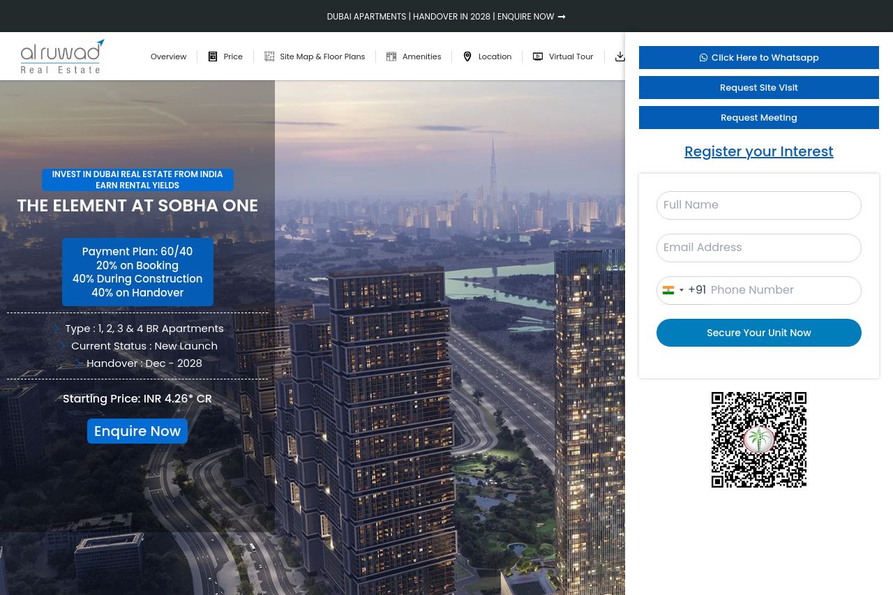
Starting Price: INR 4.26* CR
41
Generated on:
July 7, 2025Score:
41/100Share on:
Summary:
50
Messaging
40
Readability
35
Structure
30
Actionability
45
Design
35
Credibility
The landing page is trying to sell a real estate property in Dubai to an Indian audience. The hero section is filled with a lot of information, but it lacks a strong, enticing headline that grabs attention. The visual layout is cluttered and the call-to-action buttons blend too much into the background. There's a QR code, but without clear context, it's more distracting than helpful. The text in other sections is overwhelming and not broken down into digestible parts. The pricing section is plain and misses impactful imagery that could appeal to high-end buyers. Overall, this page is confusing and fails to make a distinct impression or establish urgency and trust.
Main Recommendations:
- Redesign the hero image with a clearer, more persuasive headline and a simplified layout.
- Improve CTAs by making them bigger and more distinct in color and placement.
- Refine the text to make it more concise and visually break it down for readability.
- Provide more context or instructions for the QR code to prevent it from being a distraction.
- Use impactful images in the pricing section to better engage the target audience.