lovable.app
Landing Page Analysis
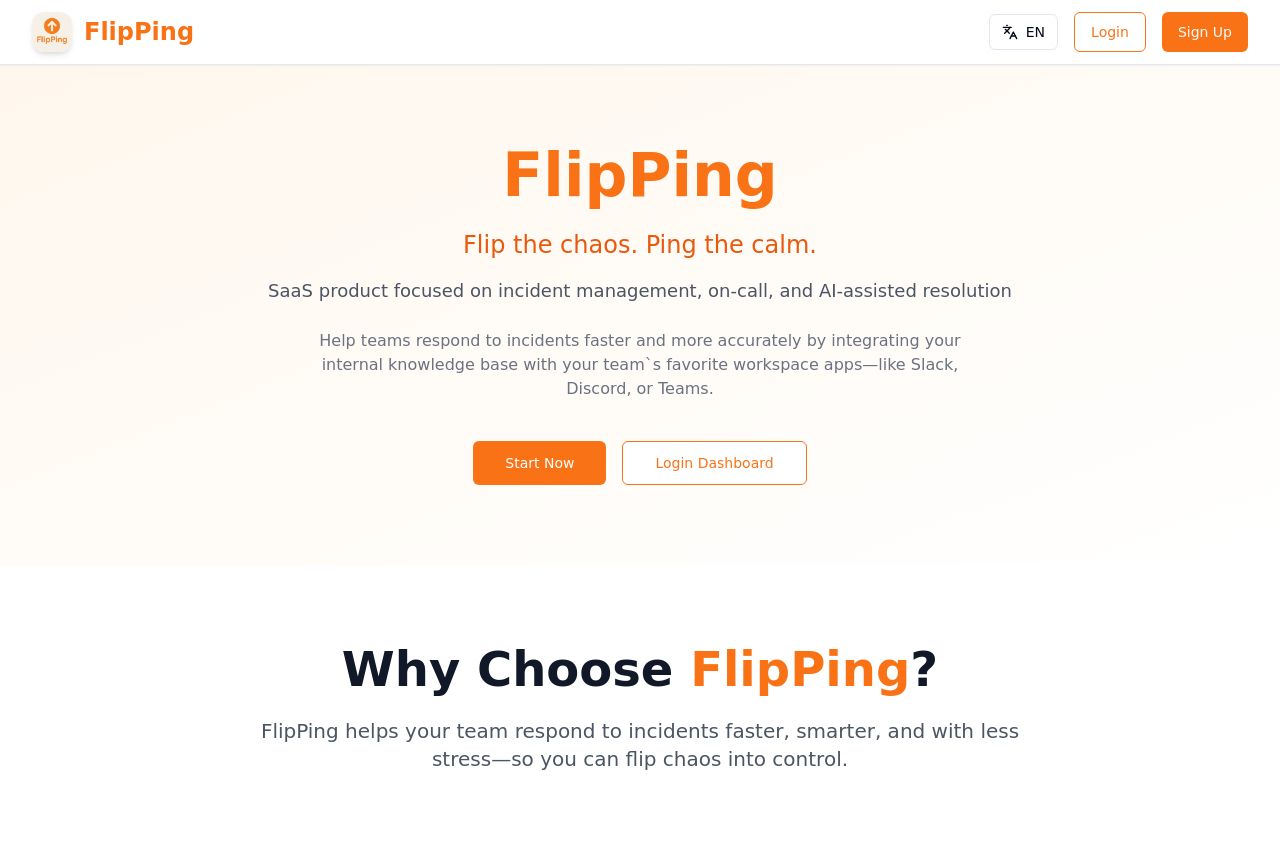
SaaS product focused on incident management, on-call, and AI-assisted resolution
Summary:
FlipPing's landing page is off to a good start but has significant room for improvement. The hero section does a solid job of presenting the key message: "Flip the chaos. Ping the calm," but it could better capture the unique features of the product right there. The value proposition is clear yet lacking in repeating key benefits or features.
The design uses a clean layout that avoids clutter, which is great, but the use of colors feels basic and lacks flair that could capture attention more effectively. There's good contrast for readability, though the font size discrepancies across sections can cause a disjointed reading experience.
While the landing page logically presents information flow, it desperately needs more detailed use cases tailored to engineering teams to resonate deeper with its audience. Social proof elements like testimonials are missing, weakening trust.
The calls-to-action are clear and action-oriented but could be more prominent. Explore options like highlighting urgency to boost action rates.
- Enhance the hero section with more specific benefits or features.
- Add testimonials or case studies for social proof.
- Improve color scheme to make CTAs and key sections stand out more.