bidwiser.io
Landing Page Analysis
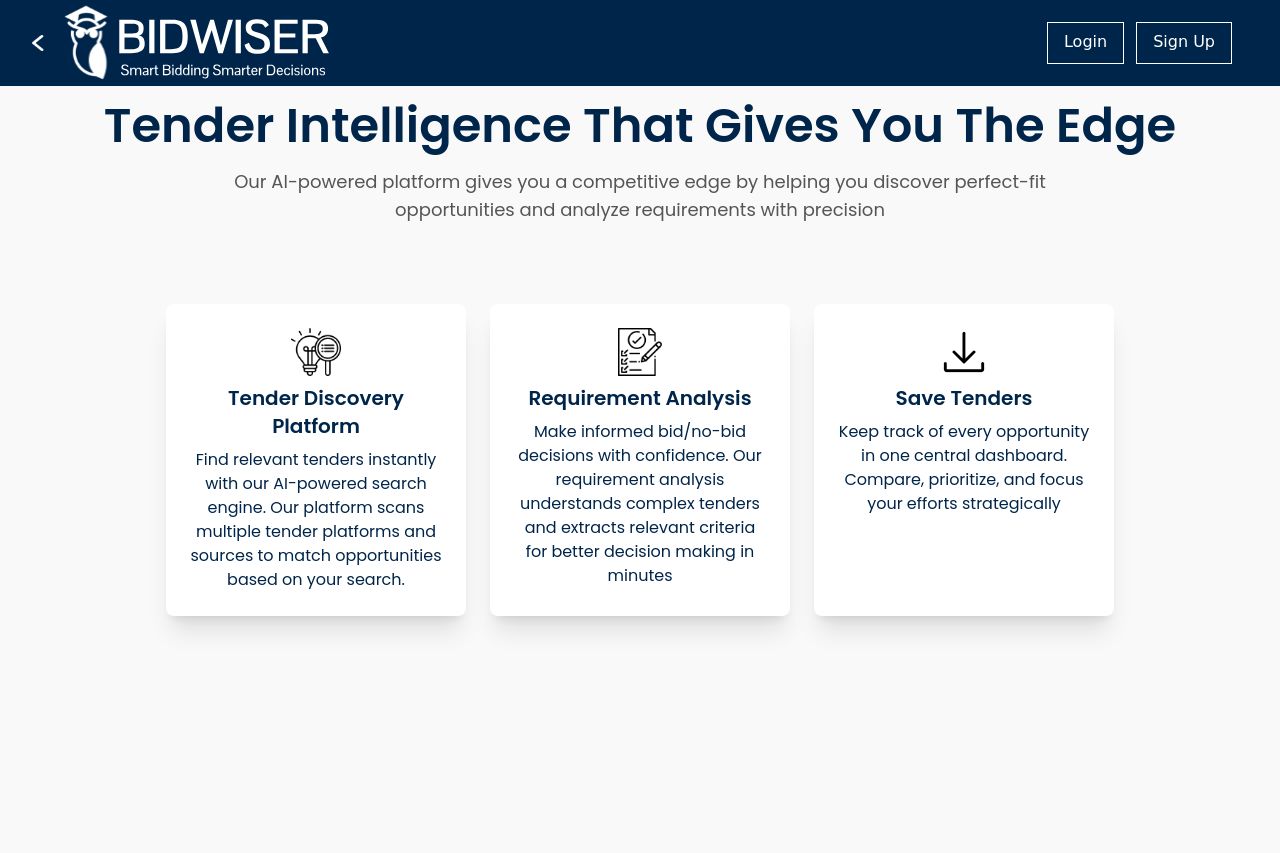
Our AI-powered platform gives you a competitive edge by helping you discover perfect-fit opportunities and analyze requirements with precision
Summary:
Bidwiser's landing page has a clear and professional setup, but lacks a punch in some critical areas.
The main headline, "Tender Intelligence That Gives You The Edge," is strong but a bit generic. The supporting line about the AI-powered platform could benefit from more specifics to create intrigue and excitement. The three-step feature explanation is organized nicely but could use visual enhancements to stand out a bit more. All sections are easy to read, with simple typography and layout choices, but there’s little excitement to grab the user's attention.
The call-to-action elements like "Login" and "Sign Up" are appropriately positioned but blend too much with other elements, lacking urgency or a distinct standout quality. Additionally, there is a scarcity of credibility indicators like testimonials or recognizable logos, leaving much to be desired in terms of gaining user trust quickly. However, the overall professional appearance adds a layer of trustworthiness.
There's a general sense of cohesion in design, albeit minimalistic, yet some color contrast could elevate the entire visual appeal. The page generally communicates the essential features well but doesn't go beyond ticking boxes in terms of user engagement and brand building.
- Enhance the main value proposition with more specific details about what makes the AI platform unique.
- Incorporate more engaging visuals or examples to break the monotony and illustrate use cases.
- Improve CTA visibility by using contrasting colors or bold design elements to make them stand out.