wiloo.es
Landing Page Analysis
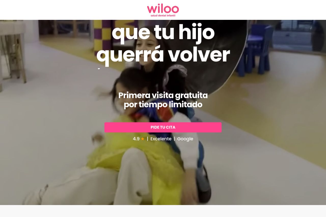
4.9 ★ | Excelente | Google
Summary:
Overall, the landing page presents a strong, reassuring theme for a pediatric dental clinic. The immediate emphasis on a free first visit is a smart strategy to attract new clients, providing urgency and a clear call to action. Visual elements, including vibrant colors and engaging images, are aligned with the youthful audience, though the text could leverage simpler constructions for better reader understanding. A well-defined audience is evident, but the messaging is a mixed bag. The content specifically targets parents of children but occasionally suffers from overly complex language. Design consistency is generally good, with uniform typography and color use. The page's credibility is boosted by visible reviews and team member introductions, though more social proof could enhance trust.
- Simplify the text for better readability.
- Increase the number of social proof elements.
- Improve Open Graph data for better shareability.