planoki.app
Landing Page Analysis
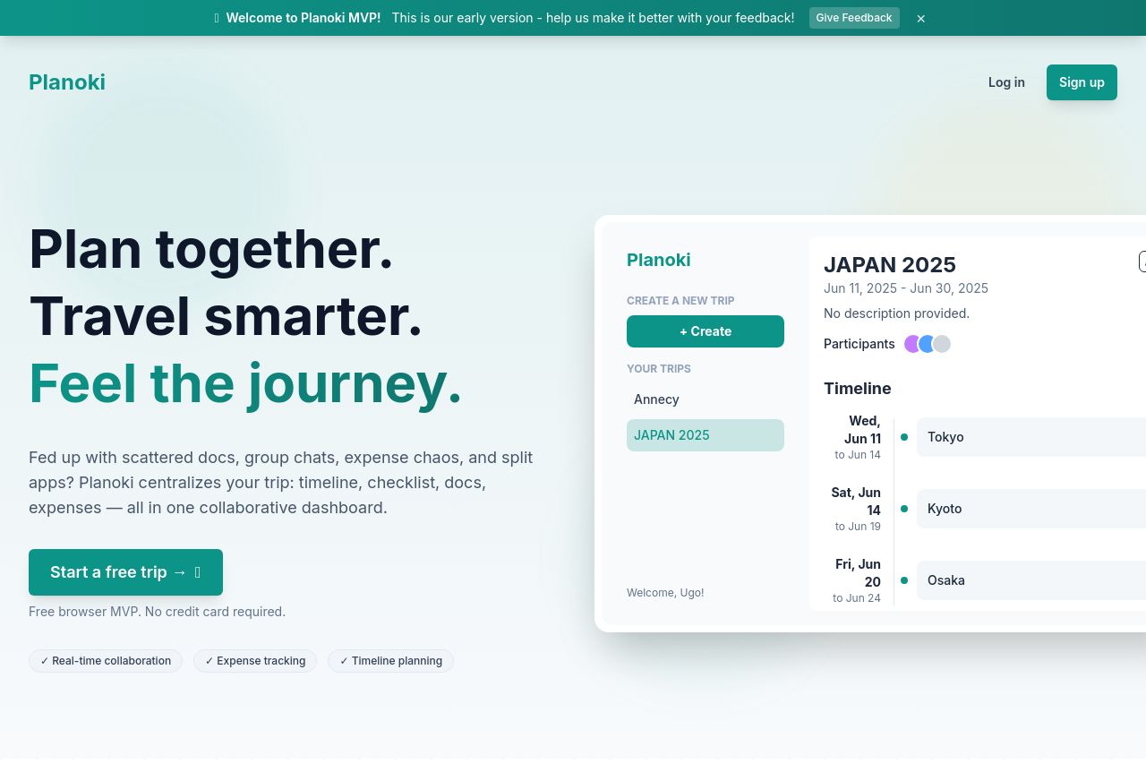
Transform your group travel planning with Planoki. Collaborative trip planning made easy with timeline management, expense tracking, todo lists, and real-time collaboration. Start planning your next a
Summary:
Planoki's landing page seems to know its audience quite well, which helps in creating a connection with them. Certain design elements work well, such as the clean layout and clear, easy-to-read text. The descriptions actually manage to convey the benefits without overwhelming viewers with walls of text.
However, the lack of a really standout CTA is a downer; it’s there, just not demanding to be clicked. While the value proposition isn't vague, it sort of tiptoes around being bold. And let's talk about the visuals; they border on boring, the kind that could put insomniacs to sleep in no time. Ironically, this vanilla design is also its saving grace when it comes to consistency, but a bit more personality couldn't hurt.
In terms of credibility, their attempt to throw in social proofs is okay but not excellent; they exist, but they don't impress. The structure is passable; a tad more flair in bit placements could lead users toward the CTA better. Overall, it's a functioning but forgettable experience that needs someone to shake things up a bit.
- Design a more prominent, eye-catching CTA button by using bold colors and font sizes.
- Introduce dynamic elements like animations or interactive features to make the page more engaging.
- Include more compelling images or visuals that resonate emotionally with the target audience.