systeme.io
Landing Page Analysis
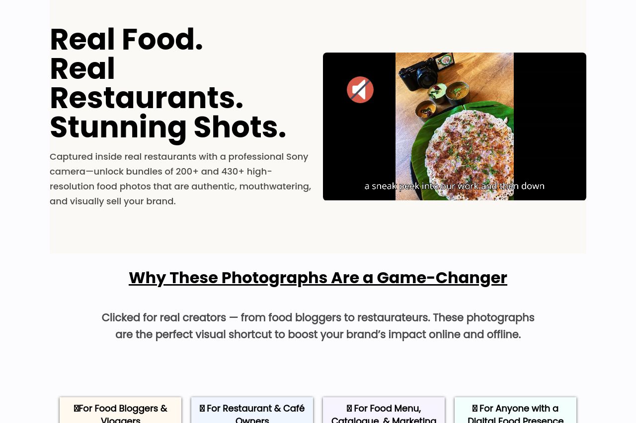
Captured inside real restaurants with a professional Sony camera—unlock bundles of 200+ and 430+ high-resolution food photos that are authentic, mouthwatering, and visually sell your brand.
Summary:
The landing page does reasonably well at highlighting the service's core offerings through clear visual cues and dedicated sections for different audiences. The headlines do a decent job capturing attention with a direct appeal (e.g., "Stunning Shots"), but the long paragraphs clutter this effectiveness. The unique selling points are moderately clear, but there's a need for bolder, more distinct CTAs to drive conversions.
The readability is somewhat compromised by the excessive text density and complex sentences, which is a barrier to quick comprehension. The design maintains some consistency, but the color scheme and layout could be refined for better impact. Social proof is notably missing, which could undermine trust, especially for new visitors. In summary, although the sections are logically structured, the need for concise, targeted communication and enhanced visual appeal is paramount for better user engagement and conversion.
- Simplify and condense text to improve readability.
- Incorporate social proof elements such as testimonials or client logos.
- Enhance the visual contrast and color scheme for better engagement.