makeo.app
Landing Page Analysis
Are you facing a teeth alignment problem? Crooked teeth, gaps in teeth or jaw misalignment bothering you? Start your smile makeover online with toothsi
Summary:
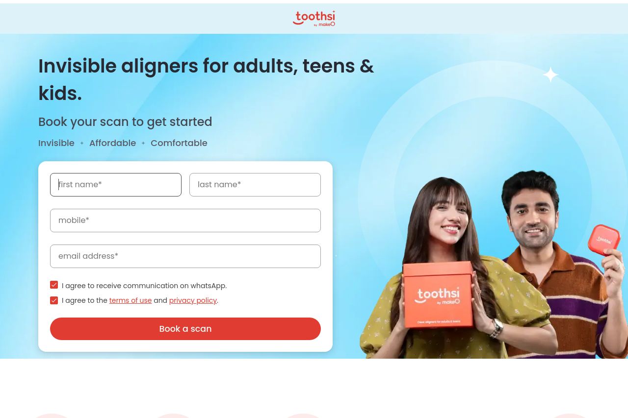
The landing page is visually appealing with a focus on clear aligners, using a bright color scheme that feels inviting and modern. However, it's cluttered, trying to fit in too much information without clear prioritization, which overwhelms rather than informs. The hero section attempts simplicity with a straightforward CTA, but the overwhelming amount of surrounding information about "3,00,000+ smiles designed" and other stats distracts from the focal point, which is booking a scan.
Messaging is a bit mixed, targeting everyone from children to adults, which doesn't allow for specific resonance. The tone feels casual enough for younger audiences but might be a bit too relaxed for older demographics seeking professional services. There's an attempt at assurance with phrases like "Superior quality, affordable prices," but without standout CTA designs, the urgency to act is diluted.
The readability suffers from small text blocks crammed with information, and although the typography is consistent, it could benefit from more visual hierarchy to better guide the viewer's eye. The images do support the narrative but aren’t leveraged enough to lead a user step-by-step.
Design-wise, consistency is strong but borders on generic. The CTA placement feels functional but uninspired and lacks strategic positioning throughout sections. Social proof is robust with testimonials and US FDA clearance, but transparency about processes and costs doesn’t stand out as clearly. Overall, it’s a page trying to do too much without sharpening its focus enough.
- Clarify the primary value proposition and key message for each target audience segment to prevent messaging from being too generic.
- Improve visual hierarchy in all sections to better guide the user's attention, emphasizing CTAs and key benefits.
- Simplify and condense text throughout the page to enhance readability and keep the focus on essential information.