examp1e.net
Landing Page Analysis
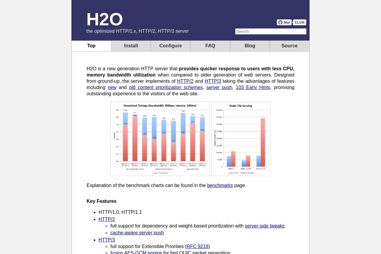
the optimized HTTP/1.x, HTTP/2, HTTP/3 server
Summary:
The page is overly technical and feels cluttered with dense information that might not resonate well with all website administrators. The hero section introduces the product effectively but lacks a striking visual appeal that could make it more memorable. There's a noticeable absence of engaging visuals or interactive demos that could showcase real-world application and benefits. The text-heavy format makes it hard for key features and benefits to stand out. It's almost like the page was thrown together without much thought for design aesthetics. While the technical specifications and updates are comprehensive, they could have been organized more thoughtfully to aid readability and focus. The Call to Action (CTA) elements are practically invisible, lacking emphasis or proper placement to guide the user journey effectively. The value proposition is there, but it’s buried under a mountain of technical jargon that less technical administrators might find off-putting. Overall, it feels like an engineer wrote it with no thought for how it should look to the reader.
- Redesign sections to improve visual clarity and engagement.
- Simplify language for broader audience appeal.
- Highlight CTAs with better placement and design.