postjobsnow.com
Landing Page Analysis
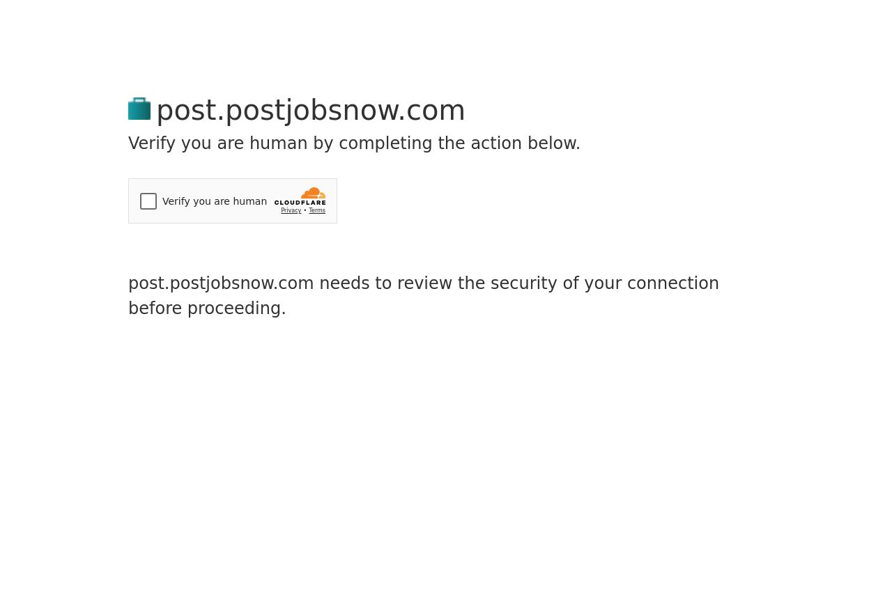
Verify you are human by completing the action below.
27

Share on:
Summary:
20
Messaging
45
Readability
30
Structure
10
Actionability
35
Design
10
Credibility
This CAPTCHA page is really lacking in terms of design and messaging. The page layout is extremely bare-bones, offering nothing more than a checkbox and a simplistic message. The messaging is functional but uninspiring, doing the bare minimum to inform the user about the security check. There's no visual appeal, engaging content, or incentives for user interaction. The design is plain with insipid typography and no compelling color scheme, giving off a very utilitarian vibe. It's functional but lacks any polish or branding elements to reassure the viewer that they're on a trustworthy page.
Main Recommendations:
- Incorporate branding elements like logos or color schemes to make the page feel more professional and trustworthy.
- Enhance the messaging to explain why the CAPTCHA is important, possibly with added visuals or graphics for engagement.
- Include reassurance messages like 'Your security is important to us' to create a sense of safety and concern for user experience.