affluencecorner.com
Landing Page Analysis
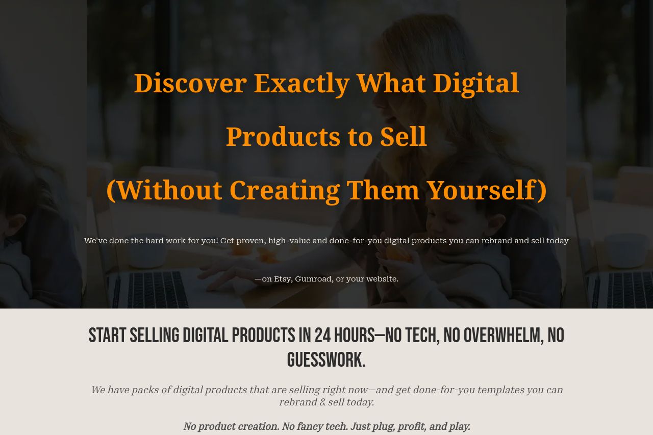
If you've ever Googled "what digital products to sell" or asked yourself how to start an online business that actually makes money, you're in the right place.
Summary:
The page attempts to engage a very specific audience: aspiring entrepreneurs who lack technical skills. It uses bold claims and emotional hooks to attract this audience, promising business success without traditional obstacles. Messaging is heavily reliant on emotional appeals rather than practical value, which might resonate but also raises the question of legitimacy. The visual layout is cluttered, and the CTAs, though numerous, are scattered. The tone matches the target audience to an extent, but repetitiveness in benefits and examples can diminish credibility. Readability suffers due to wall-of-text sections and inconsistent visual emphasis, causing strain despite an abundance of information. The credibility is attempted through testimonials, but they may come across as too polished or fabricated without substantial proof. Overall, the page is trying too hard to sell through emotionally-charged language without balancing it with practical substance.
- Simplify and clarify the value proposition by focusing on practical benefits.
- Reduce repetition in text to improve readability and maintain audience interest.
- Enhance visual hierarchy to clearly distinguish key CTAs and information.