nuvoo.digital
Landing Page Analysis
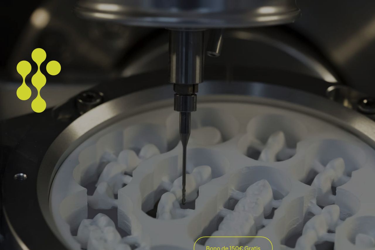
nuvoo es el laboratorio dental que transforma tu día a día clínico: prótesis de calidad, entregas puntuales y soporte real. Da el salto a una nueva forma de trabajar.
Summary:
The landing page attempts to communicate its core offerings but falters in several areas. The messaging is unclear without a strong value proposition that stands out. While some sections manage to highlight the benefits like precision and speed, overall, the information feels disjointed, with no logical flow that guides the user smoothly. The readability is hampered by the layout, where the text is cramped and lacks hierarchy. Design elements like inconsistent color usage and poorly positioned CTAs further disrupt the user experience. Additionally, the credibility section doesn't fully leverage trust elements effectively to build confidence. The overall impression is of a rushed and clunky design that needs significant refinement in both structure and clarity.
- Strengthen the value proposition so it's clear and immediate on the landing page.
- Improve the information hierarchy to guide the user more logically through the content.
- Enhance the call to action with better placement and more engaging language.