creatorfest.com
Landing Page Analysis
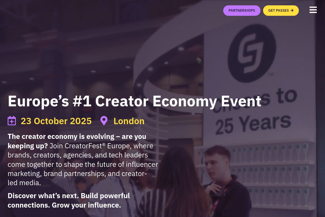
Join us at CreatorFest, Europe’s #1 Creator Economy Event. Held in London on 23 October, 2025.
Summary:
The landing page sets a strong and clear tone with its bold proclamation: "Europe’s #1 Creator Economy Event." This headline is straightforward and immediately tells the visitor what the event aims to be, which is great. However, the design seems to lean heavily on the dark purple theme without much break in color, which may feel monotonous for users who spend more time on the page. The call-to-action buttons for "Get Passes" and "Partnerships" are visible and distinct, but their placement and color could be more innovative to grab attention better.
The messaging is decent, with a few well-defined sections focusing on the target audience of brands, creators, agencies, and tech leaders. However, the language could use a little more dynamism to better engage these high-profile visitors. Readability is alright, but some more contrast in design elements could enhance visual clarity. Meanwhile, the structure seems straightforward, though it lacks rich multimedia components to really sell the event. The credibility of the event is bolstered by its positioning and professional design, but there are no testimonials or social proof elements to back up the claims. Overall, a solid but not spectacular landing page.
- Add more interactive elements or multimedia to engage the audience.
- Include testimonials or social proofs to boost credibility.
- Revamp CTA colors and placement to enhance visibility and actionability.