wiloo.es
Landing Page Analysis
Primera visita gratuita por tiempo limitado
Summary:
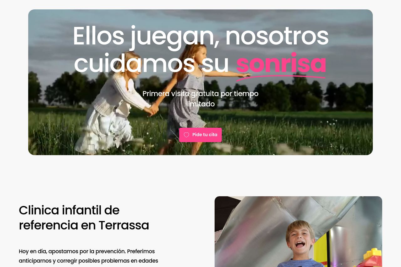
The page presents a friendly and approachable design suited for a pediatric dental clinic.
The imagery and bright color scheme effectively create a welcoming feel, especially appealing to children and their parents. However, the lack of detailed service descriptions and some vague headings don't fully express the unique value of the clinic. Repeated calls to action ('Pide tu cita') help guide users but may overwhelm since they're excessively frequent. The testimonials are missing, which could enhance credibility.
Typography and layout are simplistic but effective, though the wide paragraphs and some lengthy sentences could benefit from better structuring for readability. The focus on imagery of children plays into the playful theme, but the images lack contextual connection to services offered. Overall, while the page has potential, there's a need for clarity in messaging and better structuring to really grab the visitor's attention and facilitate conversion.
- Include detailed service descriptions to clearly convey offerings.
- Reduce the frequency of CTAs to prevent overwhelming users.
- Add testimonials or reviews to build credibility.
- Use more specific and engaging headings for better readability.
- Incorporate service-related imagery for context.