smile2impress.com
Landing Page Analysis
¡Por tiempo limitado!

Summary:
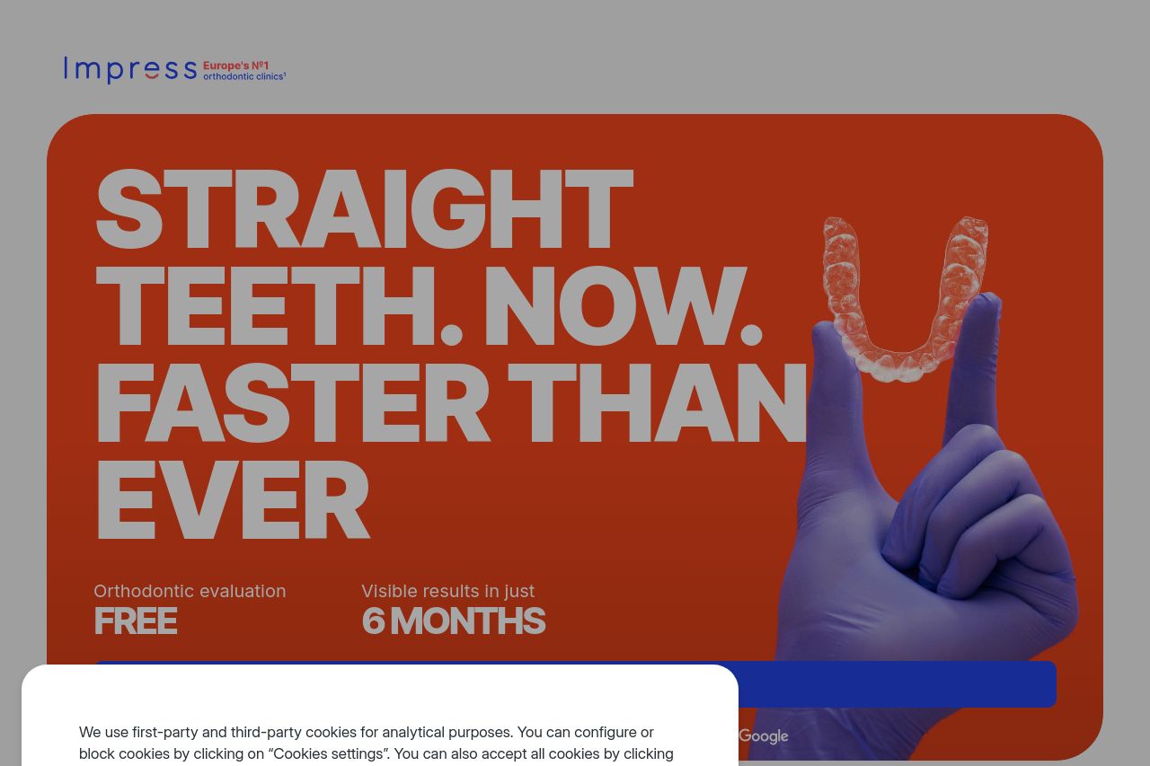
The landing page has a clean and professional design with a few key strengths and weaknesses. The value proposition is clear and effectively communicated, thanks to attention-grabbing headlines like "Straight Teeth. Now. Faster Than Ever." The repetition of benefits such as "FREE orthodontic evaluation" and "Visible results in just 6 MONTHS" is spot-on. The visuals are supportive of the message, although the cookie consent keeps annoyingly popping up, obstructing the view and user interaction.
While
CTAs are bold and prominent, they lack differentiation and variation, reducing their impact. Moreover, the readability suffers slightly due to the lack of contrast between text and backgrounds in some areas. The social proof and testimonials are strong, but the overall user flow is hampered by the repeated presence of the cookie banner. Structurally, the page tries to guide but can feel disconnected across sections at times, especially with the juxtaposition of English and Spanish text. Overall, it's reasonably effective but could be optimized further to enhance both usability and conversion rates.
- Eliminate the intrusive cookie consent frequency to enhance user experience.
- Increase text-background contrast for better readability.
- Improve CTA differentiation to boost interaction.