berisalam.net
Landing Page Analysis
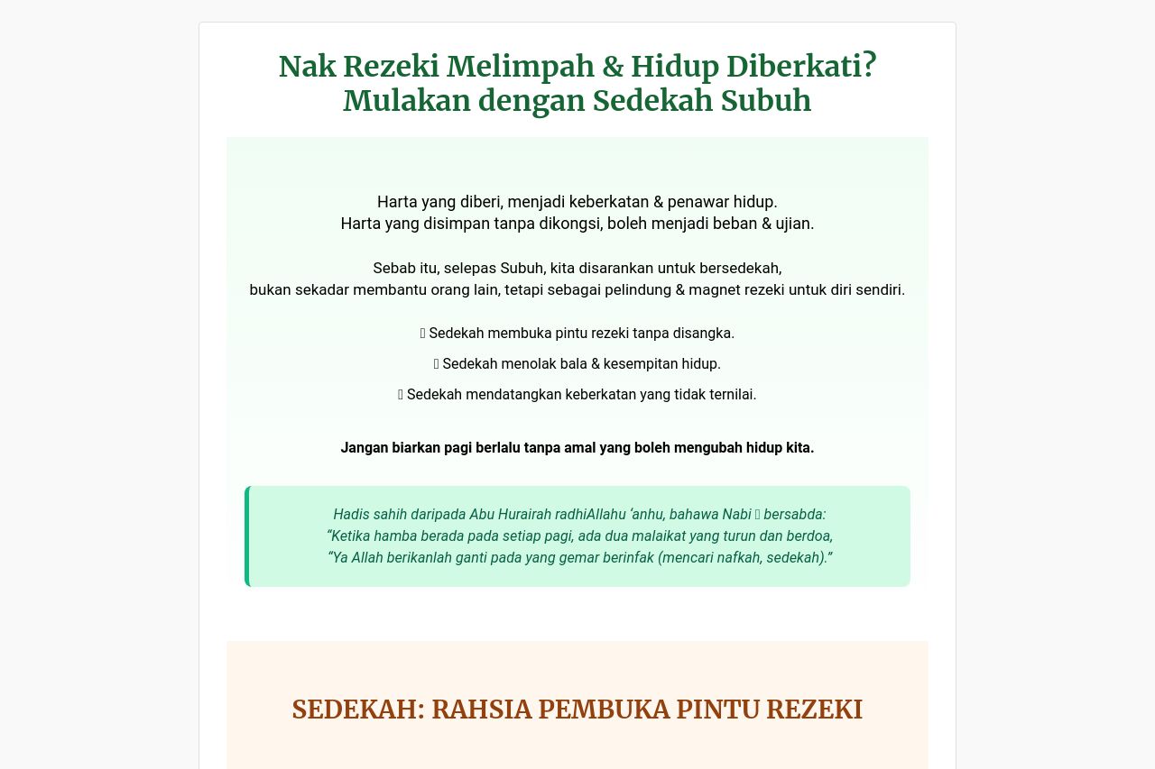
Harta yang diberi, menjadi keberkatan & penawar hidup.Harta yang disimpan tanpa dikongsi, boleh menjadi beban & ujian.

Summary:
The landing page does a decent job of highlighting the core message about donations and support for education, but it suffers from several flaws. The value proposition is somewhat clear, but could use more emphasis on urgency and emotional appeal. Messaging does outline the benefits of donations well, though the audience is quite broad and could be better defined. Readability is generally good, but long sections of text might bore users, reducing engagement. The design lacks visual hierarchy and consistency, making navigation slightly confusing. CTAs are present but lack the punch needed to drive action, and there are too many different donation options which might overwhelm the user. Some credibility elements are present, like contact info and QR payment, but visual appeal could enhance professionalism. Overall, the page needs a clearer focus and better design consistency to make it effective.
- Simplify and emphasize the main CTA to increase actionability.
- Introduce visual hierarchy with better font sizes and colors.
- Optimize text to be more concise and engaging, using bullet points or short sentences.