google.com
Landing Page Analysis
Book Your FREE Profit Analysis Now!

Summary:
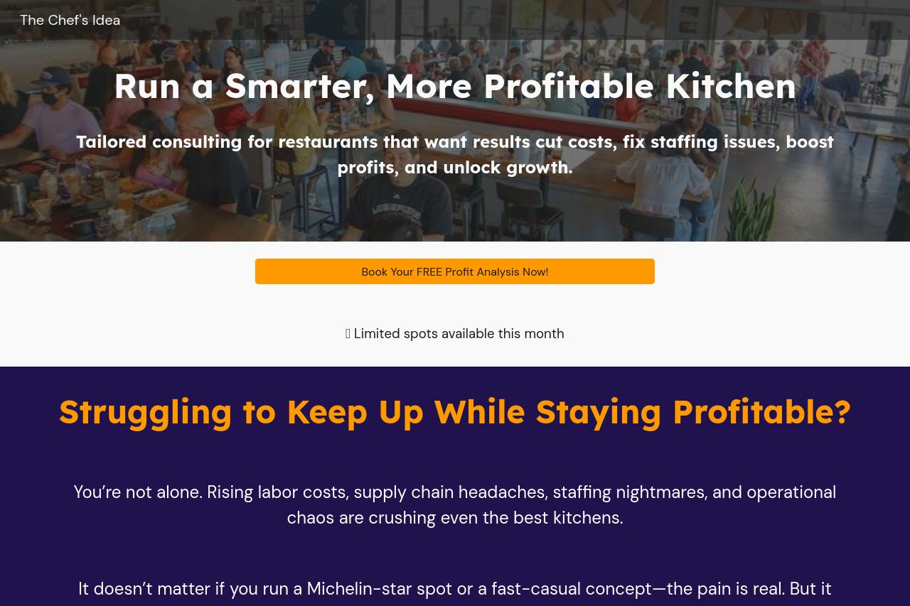
The Chef's Idea landing page has a decent start but needs improvement. The value proposition is articulated well but could be clearer by targeting specific restaurant pain points. The audience is somewhat identified, but more direct mentions would help. The tone is conversational, fitting for B2B, yet lacks some professional edge.
Design-wise, there's a good use of headings and colors, but sections could be better aligned for readability. The overall color scheme is consistent but doesn't particularly stand out. The structure is logical, guiding users through offerings and benefits, though some sections are repetitive. CTAs are prominent but generic, reducing their impact. Overall professionalism is decent, but adding more trust elements and breaking down monotony could enhance credibility.
- Enhance clarity of the value proposition by specifying common restaurant issues.
- Use more specific and varied CTAs to increase user engagement.
- Improve testimonial section with more detailed client success stories.