hosted.app
Landing Page Analysis
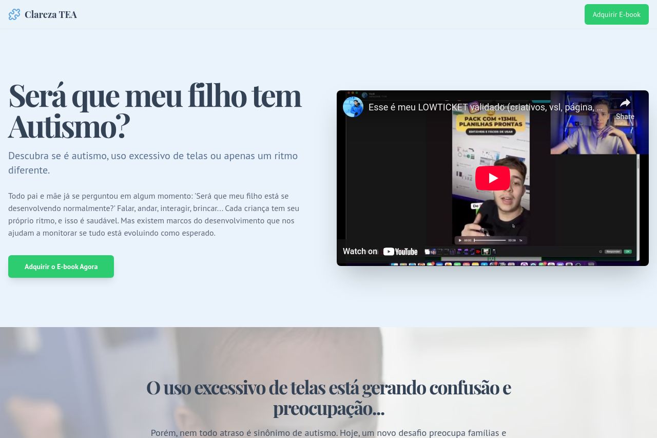
Descubra se é autismo, uso excessivo de telas ou apenas um ritmo diferente.
Summary:
The landing page attempts to address concerns about children's development, particularly regarding autism or screen use. It uses emotional language to connect with worried parents, but there's a lot of room for improvement. Visually, the page has a clean layout, but it lacks distinctive elements to grab attention. The messaging is reasonably clear but somewhat redundant in places. The call-to-action (CTA) is visible, yet there's a lack of urgency or incentives to act. Social proof like testimonials are present but not well integrated. The overall design feels repetitive and could be more engaging visually. Hierarchical structure exists but could leverage contrast and varied font weights better for emphasis.
- Enhance the CTA by adding urgency or exclusive offers.
- Improve visual hierarchy through varied font sizes and clever use of color.
- Incorporate authentic, compelling testimonials to boost credibility.
- Revise repetitive text sections for variety and impact.
- Highlight key points using icons or graphics more effectively.